Copyright The Design Chaser 2012. Powered by Blogger.

Search Bar

Social Media

Text Space

THE DESIGN CHASER

Take Refuge this Winter with Soothing Earth-Based Hues from Dulux

5.19.2022

Inviting warmth and a particular energy into your home can be a crucial step to successfully transitioning to indoor living and entertaining during the winter months. To help you get there, why not integrate the latest colour trends to establish a welcoming, yet intimate atmosphere for all to enjoy. Dulux’s Restore Palette – one of three colour palettes from the 2022 Dulux Colour Forecast – is made up of the rich, soothing colours of Dulux Lauder, Waiau Bay Half, Wigram and Natural Flora (amongst others), which evoke a feeling of comfort and warmth, often much-needed to combat the winter blues that can accompany a seasonal change.


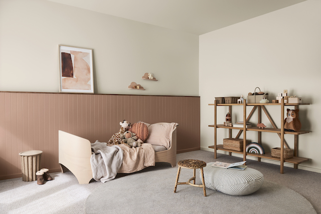
Wall (top) and ceiling: Dulux Waiau Bay half; Wall (bottom): Dulux Lauder 

Dulux Colour Specialist Davina Harper says that the Restore palette is perfect for a winter makeover as the colours will be easy to use in most spaces due to their natural appeal. “Dulux Natural Flora and Hog Bristle® Half have a warmth that will create a comforting and restful space, perfect for bedrooms. The deeper colours of Dulux Peep-O-Day, Finnegan and Oboe D’Amore are well suited as accents for communal areas, like the living room or entry, to help liven up these high-traffic spaces. “To add a scheme, the more muted, neutral colours of Dulux Ōpononi Quarter, Duvauchelle, Ōpononi Double, Millwater and Narrow Neck Half will be incredibly popular across all interiors this season as they sit back and shouldn’t create a sense of feeling overwhelmed,” Harper says.

Before 

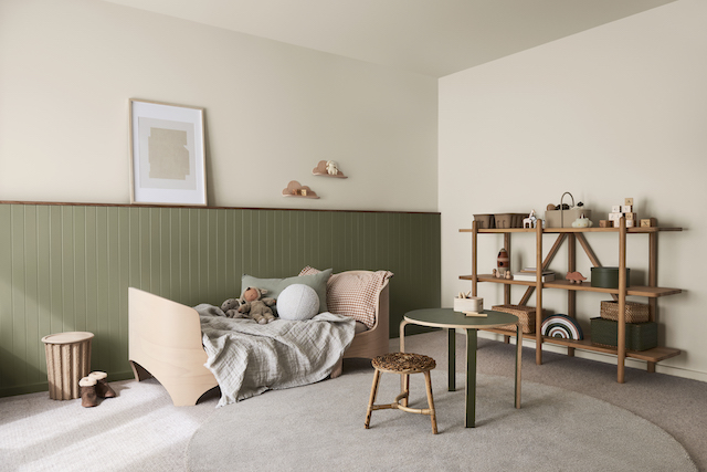
To showcase these idyllic hues in the home environment, Dulux Colour Forecaster and stylist Bree Leech undertook a multi-room makeover in a renovated 80s brick home, integrating colours from the Restore palette. “We chose to makeover three rooms – a toddler’s bedroom and two entry areas – showing the versatility of the palette to energise different interior spaces.“Both accent colours add interest and make the bedroom more inspiring for a young child but are also colours that they can keep as they grow,” Leech says.

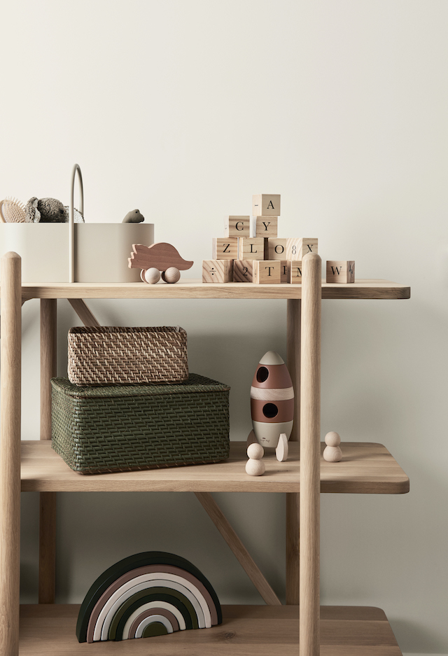
One room in two ways, the toddler’s room was completely reinvigorated with the option of Lauder or Natural Flora as the feature colour, paired with Waiau Bay Half, a warm white to help soften the space. “Both accent colours add interest and make the bedroom more inspiring for a young child but are also colours that they can keep as they grow,” Leech says.“To add even more texture and warmth to our toddler’s space, we featured pale timber, woven cane and natural fabrics such as linen, cotton and wool; we also amped up the texture by adding a thick pile rug to the already carpeted floor."


Wall (top) and ceiling: Dulux Waiau Bay half; Wall (bottom): Dulux Natural Flora 

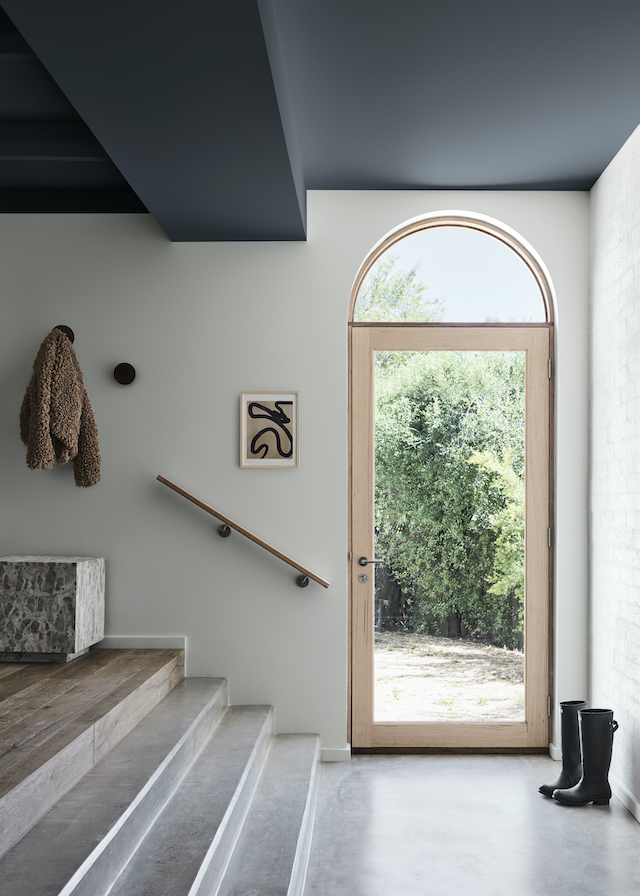
With the two entries, the intention was to make both spaces feel more inviting, sophisticated and memorable for the homeowners as well as first-time or returning guests. “The entries have gorgeous, exposed beams and curved arched doorways; we wanted to celebrate both architectural features and did so through colour and décor,” Leech says.

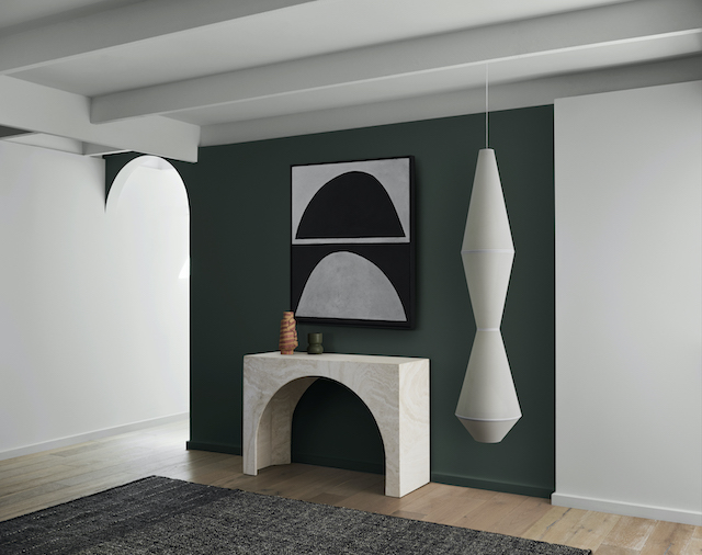
Ceiling: Dulux Peep-O-Day; Wall: Dulux Millwater

“Using the gorgeous Dulux Peep-O-Day on the ceiling in the main entry and Finnegan as an accent in the secondary, we paired each with striking art and handmade ceramics to give both rooms more character. A more sophisticated edge is provided through the feature pendant lighting. The addition of a rug breaks up floor space for a cosy yet spacious look and feel,” Leech adds.
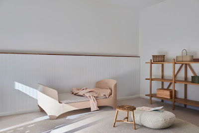
Before

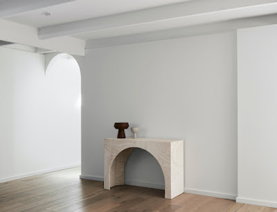
Wall: Dulux Finnegan; Wall and Ceiling: Dulux Millwater

According to Dulux Colour Expert Andrea Lucena-Orr, due to the naturality of these hues, there will be many colours that resonate with both first-time decorators and long-time colour lovers. “My advice is to just have a go! Not much can go wrong using this gorgeous, soothing and relaxed palette. Whether you’re transforming a bedroom, living space or hallway/entry, it’s amazing how a change in colour gives you a whole new perspective on the space,” Lucena-Orr adds.

Winter colour tips from Dulux’s Colour Expert: Davina Harper

• When considering colours for your walls, always factor in existing fittings and decor that will remain once the makeover is complete. This may be flooring, cabinetry, window colour, furniture, etc. – knowing what colours and textures will remain will help drive your colour decisions with paint.

• Also determine whether your room relies on a lot of natural or artificial light to help add warmth and atmosphere to the space. For example, south-facing rooms will do well with warmer colours in the palette to keep that sense of light and brightness.

• For those looking to integrate the Restore palette in their own homes, start with a lighter colour from the palette to provide a natural base, then add deeper and richer colours such as earthy greens, red/browns and charcoal to bring some depth and interest.

• Paint’s not just for walls – try it out on décor and accessories like ceramic sculptures, pictures frames and lamps! This is a subtle but impactful way to add new life to a room, especially for those who may not feel ready to inject colour on a larger scale.

• Always test colours with Dulux Sample Pots before you purchase to ensure you’re happy with the final colour choice. Leave your painted samples up for at least two or three days to ensure the colour(s) work in your space and under different lighting conditions, both natural and artificial and view in different weather conditions i.e., bright sunny day versus a dull grey day.

To learn more about Dulux's Colour Forecast visit www.dulux.co.nz.

Image Credits 

Styling by Bree Leech
Photography by Lisa Cohen 


AD / This is a Paid Partnership post. I only work with products I love and all opinions are my own. For more information please visit my About Page.

VIEW STORY
Pin ThisShare on Tumblr

Bokanoswsi Apartment by Heju Studio

7.17.2020

Paris-based Heju Studio was founded in 2014 by Hélène Pinaud and Julien Schwartzmann, two architecture graduates who first met on the benches of the École Nationale Supérieure d'Architecture de Strasbourg. With a shared appreciation for Japanese and Scandinavian design, their work is influenced by both, and they create timeless spaces centred around rectilinear lines and minimalist volumes. For their latest project they have transformed a 70s apartment into a functional home for modern day living, while carefully retaining the soul of the original dwelling. Reflecting the studio’s preference for natural materials that develop a patina over time and light wood elements to illuminate the spaces, the renovation marries contemporary design with vintage elements.


Located in Asnières-sur-Seine, in the Île-de-France region, northwest of Paris, the apartment features poured and waxed concrete flooring throughout, providing a refined fluidity that is counterbalanced by the warmth of light wooden ceilings. Arch-shaped alcoves in the living room house different functions and are enhanced by a playful curation of furniture in bold shapes and colours, along with striking art and ceramic pieces. 


Experts at applying touches of colour to highlight architectural elements and create contrasts between dark and light shades, Heju Studio have applied colour in the entrance to create a rhythmic and geometric layout. Designed in a deliberately vintage style with walnut and petrol blue furniture, the kitchen is softened by a beige terrazzo worktop and a light grey waxed concrete splashback. Opposite, a rounded wooden table against a composition of pale pink wall mouldings creates a cosy breakfast nook. 


The light-filled children's room takes its cues from Alvar Aalto, while the master bedroom's more sober aesthetic is enlivened by a headboard made of concrete volumes. Cleverly designed, it serves as a shelf, dressing table and bedside table. The bathroom is centered around natural materials with small clear tiles and white earthenware, while an oversized basin and corner mirror give the illusion of more space. 


Images courtesy of Heju Studio

Visit Heju Studio to see more of their inspiring projects, and follow along on Instagram @hejustudio

VIEW STORY
Pin ThisShare on Tumblr

Bondi Junction House by Alexander &CO.

6.18.2020

Having admired and featured some incredible projects by Alexander &CO over the last few years, it’s exciting to see the results of one of their personal projects. The family home of Alexander & CO.’s Principal Jeremy Bull and partner and PR Director Tess Glasson and their four young boys, Bondi Junction House is both an alteration and addition to an existing 1900s Victorian terrace in the Eastern suburbs of Sydney. Inspired by the works of Finnish architect and designer Alvar Aalto, Bondi Junction is a true exploration in scale, texture, volume and practicality. 


The principle aims of the building were to accommodate the needs of a growing young family, maximise spatial economies as a low-cost build, all whilst exploring material expressiveness. Loosely referencing a modernist philosophy, the material palette reveals a contemporary interpretation of Scandinavian style. With beautiful bespoke detailing and elements that surprise, the home joyfully conveys the personal narratives of the people who live in it.


With three renovations in seven years, each stage of the development represents a significant milestone for the family. The interiors reflect this also, with various finishes, materials, and furnishings continuing to evolve, as do the needs and tastes of its occupants. 


The home has been furnished with a stunning collection of design pieces including the Gubi Lounge Chair, Ligne Roset Togo sofa, and the Quaderna Bench by Design Superstudio for Zanota, alongside a wonderful curation of sculptural ceramics from Curatorial+Co and Ondene, and artworks by Henrik Godsk and Hugh Ramage.   

Styling by Claire Delmar / Photography by Anson Smart

For more inspiration from Alexander &CO, take a look at the recently featured Queens Park House.

Images courtesy of Alexander &CO

VIEW STORY
Pin ThisShare on Tumblr

Dulux Autumn 2020: Start Nesting with Warm Neutrals and Tonal Layers

2.18.2020

As life gets increasingly busier and more complex, so too does our desire to simplify and slow down. The Grounded palette — one of four trends identified in the 2020 Dulux Colour Forecast 'Essence' — perfectly reflects this desire, with Autumn design trends inspired by the palette's calming, nature-inspired tones, with a focus on simplicity and authenticity. As a society, we are becoming increasingly concerned with sustainability and wellness. The idea of ‘minimalism with intent’ – where spaces are pared back to the essentials and accessorised with decor pieces that are meaningful to us – will come to the fore.

Dulux Wash&Wear in Cardrona and Tapawera
Rainbow Print from Norsu

“We’ve seen a much more tonal palette coming through this year,” says Davina Harper, Dulux Colour Specialist. “The bold colour contrasts of previous years have made way for subtle layering of natural hues. Depth is added through texture and materiality.”

The Grounded palette, my favourite from the Dulux 2020 Colour Forecast, combines gentle, earthy neutrals and warm whites with accents of soft coral and lavender to create a cosy, laid-back feel. And as the weather cools, it’s the perfect palette to add warmth and character to our homes.

“The Grounded palette is one that homeowners will love – it’s easy to work with and has a relaxed yet sophisticated feel,” says Davina. “Warm, biscuity tones derived from nature feel calm and comforting, and adding in touches of muted coral, mauve and gold gives the look a contemporary edge.

To show you just how quickly and effectively colour can reinvigorate your home, stylist Bree Leech transformed a bland, all-white kid’s bedroom using the Dulux Grounded palette.

Dulux Wash&Wear Taparewa, Cardrona and Hint of Lavender 
Artwork: Untitled by Tracey Mock from Norsu

“Colour is the greatest tool you can use in your home – with very little effort or expense, you can completely change the look and feel of a space,” says Bree. “All you need is a few spare hours, a paintbrush and a couple of cans of paint – then it’s like stepping into a whole new room."

While the bedroom itself has great features, including a high ceiling, a beautiful, solid timber floor, French doors, plenty of natural light and a striking brick fireplace, Bree says “This bedroom’s all-white palette made it feel a little uninviting – the exact opposite of what you want in a child’s room. I wanted to add warmth and personality to the space so that its little occupant would enjoy spending time here. I aimed to highlight the room’s best features, detract from the less appealing ones – and spend next to nothing. To keep the budget in check, we kept the main pieces of furniture – a feature toddler bed with timber detailing and a curvy armchair and ottoman.

“The Grounded palette was perfect. It’s cosy and inviting, but still manages to feel light and airy. With its tones of putty and biscuit, it’s versatile enough to make a great base for either a girl’s or boy’s scheme. Add some personality with elements of soft grey and terracotta or lavender and coral, as we’ve done here,” says Bree.

Dulux Wash&Wear in Tapawera, Cardrona and Hint of Lavender
Artwork: Untitled by Tracey Mock from Norsu

When you’re choosing a palette, it’s best to start with one main colour, which you can use across large areas, such as walls, then a supporting hue and one or two accents. Retaining the existing warm white (Dulux Wash&Wear in Cardrona) for the fireplace and ceiling,  Bree chose a soft clay (Dulux Wash&Wear in Taparewa) for the walls as a feature, to tie in with the warmth of the timber floor and the detailing on the bed; a muted lavender (Dulux Wash&Wear in Hint of Lavender) for the new door on the fireplace opening; and added touches of coral in the bedding.

Dulux Wash&Wear in Tapawera and Cardrona

“We made the bed the hero of the room by piling it high with comfy pillows and using bedlinen in shades of grey and coral. An inexpensive rug adds softness underfoot – its round shape echoes the curves in the furniture. To accentuate the fabulous fireplace, we kept it white to subtly contrast with the walls.

“It’s important not to add too much clutter to a child’s room, particularly if it’s small, as you want to give them space to relax and play. We left plenty of breathing space and kept the sheer linen curtains to allow soft light to filter in,” says Bree.

Dulux Wash&Wear in Tapawera, Cardrona and Hint of Lavender


“A cosy space such as a bedroom is a great place to start your colour adventure,” says Davina. “Being a personal space, it’s perfect for experimenting with those colours you’ve been dreaming about. Paint a feature wall behind the bed, repaint the walls or upcycle one or two pieces of furniture, such as a bedside table or stool. And if you tire of it down the track, simply whip out your paint brush again!”

Here are some styling tips to help you achieve this beautiful look for Autumn:
  • Go tonal: For larger expanses such as walls and sofas, layer different shades of one key colour.
  • Keep it simple: Don’t overfill the space – include only those pieces you need and love.
  • Create a focal point: Every room should have one hero piece to draw the eye, whether it’s a stunning side chair or a beautiful artwork.
  • Add texture: Seek out must-touch upholstery fabrics, such as rich weaves and bouclé’s to add textural interest.
  • Celebrate natural: Don’t cover up imperfections such as the swirls and veins in a timber floor – their natural, honest feel fits with this look.
  • Embrace curves: A round ottoman, an arched mirror or a curvy sofa are on-trend and will break up the hard lines in a room.

Images styled by Bree Leech / Photography by Lisa Cohen 
Courtesy of Dulux


This is a sponsored post. I only work with products I love and all opinions are my own. For more information please visit my About Page.

VIEW STORY
Pin ThisShare on Tumblr
 

T.D.C© Theme by Blog Milk