Copyright The Design Chaser 2012. Powered by Blogger.

Search Bar

Social Media

Text Space

THE DESIGN CHASER

Dulux Winter 2020 | Decadent Tones and Luxe Detailing

5.27.2020

For Winter 2020, Dulux have drawn inspiration from their striking Indulge palette. One of the four themes identified in the 2020 Dulux Colour Forecast ‘Essence', the palette combines rich and cocooning tones of russet and berry to transform your home into a nurturing retreat for the cooler months.


“The Indulge palette is warm and sophisticated, the ideal colour cure for those gloomy winter months,” says Davina Harper, Dulux Colour Specialist. “Deep burgundy, soft violet and accents of coral and mustard feel opulent and exciting, with hints of art deco and 70s disco adding a touch of nostalgia.

A great palette for revitalising formal areas in period and heritage homes, such as the living room, dining room, hallway and master bedroom, it cleverly blends old and new so you can introduce contemporary flair into your home whilst honouring its history. To show how easy it is to rejuvenate your home for winter with colour, stylist Bree Leech made over a home office in a heritage home using the Dulux Indulge palette.

Before and After // Colours:Dulux Wash&Wear in Russet Tan and Cardrona 
Artwork: Still Life with Dianthus and Bee by Dena Khan

Paint is by far the easiest and most cost-effective way to invigorate an interior space, and what's more, Bree has achieved this without changing much of the furniture or even the curtains. She says “Given the room’s grand proportions and character, the Indulge palette of rich, saturated hues was a natural choice. I chose Dulux Wash&Wear in Russet Tan for the walls and shelving in the home office, which has a luxurious, enveloping feel. Colour contrasts can be incredibly effective when you want to highlight specific features in a room; I retained the existing white ceiling and fireplace, which were painted in Dulux Cardrona – a classic warm white, that allowed the cohesion of these elements with the white desk."


The addition of a large rug in warm colours of rust and coral that harmonises with the walls provides softness underfoot, while an art deco inspired side table was chosen to tie in with the curves of the desk and chair.

To learn more about Dulux’s 2020 Colour Forecast, Seasonal Trends or to view the eMag visit www.dulux.co.nz

Styling by Bree Leech / Photography by Lisa Cohen 


This is a sponsored post. I only work with products I love and all opinions are my own. For more information please visit my About Page.

VIEW STORY
Pin ThisShare on Tumblr

Dulux Autumn 2020: Start Nesting with Warm Neutrals and Tonal Layers

2.18.2020

As life gets increasingly busier and more complex, so too does our desire to simplify and slow down. The Grounded palette — one of four trends identified in the 2020 Dulux Colour Forecast 'Essence' — perfectly reflects this desire, with Autumn design trends inspired by the palette's calming, nature-inspired tones, with a focus on simplicity and authenticity. As a society, we are becoming increasingly concerned with sustainability and wellness. The idea of ‘minimalism with intent’ – where spaces are pared back to the essentials and accessorised with decor pieces that are meaningful to us – will come to the fore.

Dulux Wash&Wear in Cardrona and Tapawera
Rainbow Print from Norsu

“We’ve seen a much more tonal palette coming through this year,” says Davina Harper, Dulux Colour Specialist. “The bold colour contrasts of previous years have made way for subtle layering of natural hues. Depth is added through texture and materiality.”

The Grounded palette, my favourite from the Dulux 2020 Colour Forecast, combines gentle, earthy neutrals and warm whites with accents of soft coral and lavender to create a cosy, laid-back feel. And as the weather cools, it’s the perfect palette to add warmth and character to our homes.

“The Grounded palette is one that homeowners will love – it’s easy to work with and has a relaxed yet sophisticated feel,” says Davina. “Warm, biscuity tones derived from nature feel calm and comforting, and adding in touches of muted coral, mauve and gold gives the look a contemporary edge.

To show you just how quickly and effectively colour can reinvigorate your home, stylist Bree Leech transformed a bland, all-white kid’s bedroom using the Dulux Grounded palette.

Dulux Wash&Wear Taparewa, Cardrona and Hint of Lavender 
Artwork: Untitled by Tracey Mock from Norsu

“Colour is the greatest tool you can use in your home – with very little effort or expense, you can completely change the look and feel of a space,” says Bree. “All you need is a few spare hours, a paintbrush and a couple of cans of paint – then it’s like stepping into a whole new room."

While the bedroom itself has great features, including a high ceiling, a beautiful, solid timber floor, French doors, plenty of natural light and a striking brick fireplace, Bree says “This bedroom’s all-white palette made it feel a little uninviting – the exact opposite of what you want in a child’s room. I wanted to add warmth and personality to the space so that its little occupant would enjoy spending time here. I aimed to highlight the room’s best features, detract from the less appealing ones – and spend next to nothing. To keep the budget in check, we kept the main pieces of furniture – a feature toddler bed with timber detailing and a curvy armchair and ottoman.

“The Grounded palette was perfect. It’s cosy and inviting, but still manages to feel light and airy. With its tones of putty and biscuit, it’s versatile enough to make a great base for either a girl’s or boy’s scheme. Add some personality with elements of soft grey and terracotta or lavender and coral, as we’ve done here,” says Bree.

Dulux Wash&Wear in Tapawera, Cardrona and Hint of Lavender
Artwork: Untitled by Tracey Mock from Norsu

When you’re choosing a palette, it’s best to start with one main colour, which you can use across large areas, such as walls, then a supporting hue and one or two accents. Retaining the existing warm white (Dulux Wash&Wear in Cardrona) for the fireplace and ceiling,  Bree chose a soft clay (Dulux Wash&Wear in Taparewa) for the walls as a feature, to tie in with the warmth of the timber floor and the detailing on the bed; a muted lavender (Dulux Wash&Wear in Hint of Lavender) for the new door on the fireplace opening; and added touches of coral in the bedding.

Dulux Wash&Wear in Tapawera and Cardrona

“We made the bed the hero of the room by piling it high with comfy pillows and using bedlinen in shades of grey and coral. An inexpensive rug adds softness underfoot – its round shape echoes the curves in the furniture. To accentuate the fabulous fireplace, we kept it white to subtly contrast with the walls.

“It’s important not to add too much clutter to a child’s room, particularly if it’s small, as you want to give them space to relax and play. We left plenty of breathing space and kept the sheer linen curtains to allow soft light to filter in,” says Bree.

Dulux Wash&Wear in Tapawera, Cardrona and Hint of Lavender


“A cosy space such as a bedroom is a great place to start your colour adventure,” says Davina. “Being a personal space, it’s perfect for experimenting with those colours you’ve been dreaming about. Paint a feature wall behind the bed, repaint the walls or upcycle one or two pieces of furniture, such as a bedside table or stool. And if you tire of it down the track, simply whip out your paint brush again!”

Here are some styling tips to help you achieve this beautiful look for Autumn:
  • Go tonal: For larger expanses such as walls and sofas, layer different shades of one key colour.
  • Keep it simple: Don’t overfill the space – include only those pieces you need and love.
  • Create a focal point: Every room should have one hero piece to draw the eye, whether it’s a stunning side chair or a beautiful artwork.
  • Add texture: Seek out must-touch upholstery fabrics, such as rich weaves and bouclé’s to add textural interest.
  • Celebrate natural: Don’t cover up imperfections such as the swirls and veins in a timber floor – their natural, honest feel fits with this look.
  • Embrace curves: A round ottoman, an arched mirror or a curvy sofa are on-trend and will break up the hard lines in a room.

Images styled by Bree Leech / Photography by Lisa Cohen 
Courtesy of Dulux


This is a sponsored post. I only work with products I love and all opinions are my own. For more information please visit my About Page.

VIEW STORY
Pin ThisShare on Tumblr

Dulux Colour Forecast 2020: Essence

9.04.2019

This morning I attended the launch of the Dulux Colour Forecast 2020. A big highlight on the yearly calendar, I was so excited to see how this year's colour forecast, Essence, would unfold. A warm and welcoming space with beautifully curated room settings for each of the four palettes, we were treated to a delicious breakfast spread where the tables were decorated with stunning floral arrangements, reflective of the new palettes. Over from Melbourne, Bree Leech, Creative Director for the Dulux Forecast, alongside Dulux Colour specialist Davina Harper presented the four unique palettes: Comeback, Grounded, Cultivate and Indulge, plus a small, specially curated palette of four bold hues, designed to be mixed and matched with the trending palettes for an individualised look. Influenced by the world around us, where we're constantly 'on', the Dulux Colour Forecast 2020 provides an opportunity to reflect and re-energise whereby we can tune back into the essence of what matters to us. This year, the forecast is expressed through four tonal palettes that are nature-inspired, comprising soft comforting neutrals which have rich, invigorating accent hues that allow moments of personal expression.

Grounded palette featuring Dulux Tapawera and Lyttelton Quarter
Study 3’ original artwork by Jess Merlo, Forman Picture Framing


In a world where the demands on our time and attention have never been greater, it's all too easy for our innermost voice to get lost in the noise. Our energies are depleted, and we rely on routine and quick fixes to get us through the day. We yearn to step away from the madness (especially our screens!) recharging body and mind, to create a space with ‘Essence’ for our hopes and dreams to come alive. Craving more authentic, grounded experiences, at the same time, we're increasingly environmentally conscious. In response, design trends for 2020 will reflect our desire to pause and reconnect with the essence of what matters most to us. Recycled materials, nature-inspired palettes, and furniture that blends old and new will come to the fore, signalling a more mindful approach to the curation of our living spaces. Informed by extensive global trends research, the Dulux Colour Forecast 2020: Essence is a collection that brings together gentle neutrals and muted brights drawn from the natural world – botanical, mineral and oceanic.  

“With more focus on mental health, the wellness movement continues to gain momentum, as does an emphasis on natural materiality.” says Davina Harper, Dulux Colour Specialist. "Colours for 2020 are more restrained than in previous years. Brights are pulled back and influenced by nature. They appear in smaller doses – think feature walls and details –and are often used tonally as a backdrop for hero furniture pieces. Neutrals are soft and sophisticated, with a gently faded feel that speaks of stillness and calm. Clay, with its warm, earthy appeal, is emerging as a key neutral.” 


Davina's words for the direction of the 2020 forecast already make my heart sing! Now for a close look at each of the four palettes...


— Grounded —


Grounded Palette featuring Dulux Waitangi and Sandfly Point Double 
Artwork: White Desert - Egypt by Chris Sisarich, Maker’s Mkt

Having had the pleasure of attending the Dulux Colour Forecast launches for many years, I very quickly pinpoint a favourite colour palette. This year, Grounded immediately spoke to me. A beautiful medley of soft, livable neutrals, the theme stems from how our idea of 'luxury' has evolved. It once meant a hefty price tag or high-shine appeal, whereas today luxury is about craftsmanship, longevity, authenticity and understated beauty – reflections on where our new values lie. Resonating strongly, this concept underpins what I love to share here on TDC, the choices I make for our home, and what I strive to create and showcase through my styling. And I know I'm not alone. Mindful about the purchases we make and the idea of ‘less is more’ permeates every aspect of our lives, designers are creating more quality products using recycled and repurposed materials, often in natural products, such as timber and stone. Our interiors are pared-back and uncomplicated, with furniture crafted from natural materials such as timber, leather and linen. 

Grounded palette featuring Dulux Glen Murray 

The Grounded palette runs from pale biscuit and caramel through to muddy lavender, while hints of terracotta add warmth. Many of the colours can be used as the main shade throughout your home, with gold and coral making for beautiful highlights. “We’re seeing a more tonal palette for 2020, and Grounded is a perfect example. It has a soft, neutral feel that creates a sense of relaxation in a space, with gold and coral adding touches of luxe." - says Davina. An absolutely beautiful palette, I'm excited to work with these colours over the coming year! 


— Cultivate —


Cultivate Palette featuring Dulux Pencarrow and Te Aroha
Peering in (Canopy) Original artwork by Clare Brodie, Studio Gallery Melbourne


The Cultivate palette centres around nature with a serene layering of greens — from soft olive and a pistachio to verdant forest green — with accents of plum, curd and chalky blue adding an unexpected edge. No longer an afterthought in home design, nature has many positive effects on our mental and physical health, and we seek new and innovative ways to bring it inside, whether it’s growing our own food or creating lush displays of indoor plants. “The colours and textures in Cultivate are easy to work with and have a warmth that really conveys the essence of ‘home’,” says Davina. “They look beautiful paired with raw, mid-tone timbers, natural stone and transparent, coloured glass." A palette that will resonate with home enthusiasts, Davina says "the colours and textures are easy to work with and have a warmth that conveys the essence of what ‘home’ really means."


— Indulge —


Indulge palette featuring Dulux Henna Red, Ceiling in Southern Alps
Lilac Moon IV, original print by Ellie Malin, Modern Times

Indulge palette featuring Dulux Pukehina

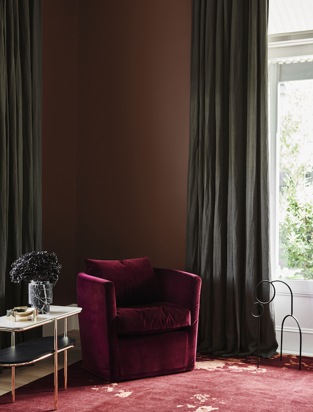
Adding drama to a space with rich burgundy, eggplant, earthy browns, faded terracotta and soft coral, the Indulge palette has certainly drawn me in. With less time on our hands and information coming at us 24/7, the desire to escape is powerful. We look to create spaces that will keep our dreams of travel and adventure alive, with rich and dramatic palettes, sumptuous fabrics such as velvets and chenille’s, curvaceous furniture that embraces the sitter and touches of bling. Colours are lush and romantic, and styling makes a nod to the past, with nostalgic touches of 70s disco and art deco. Wonderfully indulgent spaces that make us feel inspired and alive, Davina says "“This palette is not for the faint-hearted – it’s dramatic and exciting and is guaranteed to add wow factor to a master bedroom, dining room or living room. Pink, a key colour of the last few years, makes an appearance, but in a more neutral tone that’s closer to tan, alongside a warm, dusty rose.”


— Comeback —


Comeback palette featuring Dulux Mt Maunganui, Southern Alps and Master Blue

The Comeback palette centres around individuality, which is more important than even when creating intimate spaces that reflect your own personality. Looking to the past for design inspiration, mixing styles from different eras, Comeback features invigorating tonal blue shades, highlighted with warm tones of burgundy, rust and mustard that reinforce vintage storytelling. It’s a palette that hints at escape and adventure, encouraging us to step away from the drudgery of the day-to-day routine and embrace new thoughts and ideas. “There’s a lightness and fluidity to the ocean tones in this palette that speak of creativity and adventure, while the warm, earthy shades add cosiness,” says Davina. “It’s the ideal backdrop to combine furniture from different eras – from mid-century through to the 80s – in elegant and refined shapes.”


Still buzzing from this morning's launch, I hope you're as excited as I am about these inspiring colour palettes! 

To help you visualise them in your own home, all of the Dulux 2020 Forecast colours are available through the free Large Colour Swatches and also in the Sample pots. Order yours here.

To learn more about the Dulux Colour Forecast 2020, and to view the eMag, visit www.dulux.co.nz.

Images styled by Bree Leech / Photography by Lisa Cohen
Courtesy of Dulux


This is a sponsored post. I only work with products I love and all opinions are my own. For more information please visit my About Page.

VIEW STORY
Pin ThisShare on Tumblr

Autumn with Dulux | Comforting Colours Meets Rustic-Luxe Styling

3.04.2019

This Autumn Dulux NZ brings a rustic-luxe feel to the forefront with rich, natural colours, mid-tone timbers and simple yet sophisticated styling. As the weather cools and our thoughts turn to retreating indoors, the look is about bringing the outside in and creating cosy, joyful spaces that nurture and inspire.

Living room featuring Dulux Kohukohuni and Cornstalk 

Set against a backdrop of warm timber and honeyed leather, the soft grey-green – this season’s ‘new neutral’ – is my favourite for Autumn. Paired with shades of olive, dusty pink, and invigorating accents of rich, blue-green and ochre the look is derived from Repair, one of the four key palettes in the 2019 Dulux Colour Forecast that I introduced you to last year. Featuring rich greens and accents of burnished gold, the combination is both comforting and uplifting. Drawn from nature, I love that these colours plug into our collective desire to slow down and connect with the natural world.

Living room featuring Dulux Kohukohuni and Cornstalk

“Striking combinations, such as verdant green, chocolate, umber and sienna set a playful, optimistic tone, while soft, green-based grey has emerged as the neutral – and the ideal pairing for these nature-based hues", says Davina Harper, Dulux Colour Specialist.

“There’s a sense of quiet luxury to this look, but it doesn’t come down to extravagant finishes or accessories. Rather, it’s the layering of natural colours and textures – richly grained timber, time-worn leather, cork and tactile velvets. There’s also a mindful appreciation of the humble and handcrafted simple pieces – whether they’ve been collected on your travels or found in vintage stores.”

Dining area featuring Dulux Ohai Half and Cape Colville 

Even though I love summer, there is something really appealing about the change of season. The thought of spending more time indoors and snuggling up on the sofa or entertaining friends around the dining table makes me want to introduce cosy textures and colours. The beauty of the Dulux colour palettes is you can choose how far you take it. If you're feeling bold, you could go for a feature wall in a rich green or blue-green, or if like me, you prefer an understated look, you could paint the backdrop of your room in this season's subtle grey-green. 

"Adding contrast is the key to making this scheme work, so introduce doses of other colours such as terracotta, chocolate or burnt orange in varying amounts within the room," says Davina. "Complete the look with warm timber tones and buttery leathers in furniture and accessories. For an unexpected, contemporary twist, consider adding a sense of organic rawness using concrete by painting a tabletop, planters or a feature wall with Dulux Concrete Effect paint."

Bedroom featuring Dulux Big Lagoon, Otatara and Cape Colville 

In summary, here are some AUTUMN STYLING TIPS to help inject this season's theme into your own home....

Combine natural finishes: Warm timber, leather and woven rattan can create a cosy and eclectic feel.
Add a twist: Paint a bedhead or feature wall in an exhilarating shade of blue-green or ochre to spice up this palette’s warm greens and earthy tones.
Create interesting displays: Scour antiques fairs and second-hand stores for unusual collectibles.
Layer up textures and prints: Think cosy knits, aged leather, velvets and block prints.
Introduce concrete: This finish will add an eclectic feel.
Add a twist: Paint a bedhead or feature wall in an exhilarating shade of blue-green or ochre to spice up this palette’s warm greens and earthy tones.
Set up a cosy corner: A comfortable armchair or a window seat with a few soft cushions is the perfect spot to spend an Autumn’s afternoon with a good book.
Dial down the lighting: Reduce harsh overhead lighting at night and set a cosy mood with a variety of table and floor lamps.
Finish off with greenery: A trailing devil’s ivy n a bookshelf or a large, potted long-leaf fig in the corner of a room can provide a sense of calmness and reinforce a natural element.

Study Nook featuring Dulux Manaia and Cape Colville 

To learn more about Dulux’s 2019 Colour Forecast or to view the eMag visit dulux.co.nz

Styling by Bree Leech / Photography by Mike Baker 

This is a sponsored post. I only work with products I love and all opinions are my own. For more information please visit my About Page.

VIEW STORY
Pin ThisShare on Tumblr

Soothe your Senses this Summer with Soft Tones from Dulux

11.14.2018

This summer, Dulux brings Wholeself to the forefront, one of the four colour palettes identified in the 2019 Dulux Colour Forecast, Filter. A soothing theme, and my personal favourite, it will see interiors embrace the idea of soft minimalism, with palettes featuring gentle, nurturing hues, contrasting textures and dustings of mint and lemon. With the wellness movement in full swing, the focus in design will be on creating calming, reflective interior spaces that allow us to block out the visual noise and turn our attention to self-care.


This beautiful collection comprises muted shades of powdery pinks and warm neutrals, enlivened by accents of muted citrus and a minty blue-green. It speaks of simplicity and understated luxury and pairs beautifully with this season’s mid-tone timbers, soft undulating lines and relaxed design detailing.


“The Wholeself palette is all about slowing down and tuning into the things that really matter,” says Dulux Colour Specialist, Davina Harper. “Wellness has emerged as a major theme in the design world for 2019, with many of us looking to switch off our digital devices and focus on nurturing our tired bodies and spirit. The Wholeself palette brings this theme to life.” 

Gentle colours that provide a serene yet cocooning feel, these are layered with subtle textures, that hint at creative exploration and new beginnings. Powdery peach/pink has emerged as a key base colour, with accents of clay, gold and blue-green adding a fresh, modern spin.

Davina adds “This palette is a significant shift from the playful brights and rich, luxe tones of last year. Rather than looking outward for inspiration, this season’s understated colours and intriguing textures draw you inwards and encourage moments of stillness and mindfulness."


As always with the Dulux themes, the idea goes beyond paint colour. By pairing back the unnecessary, we can then surround ourselves with furniture and accessories that serve a purpose and bring happiness. Environmental awareness will also be an important thread running through design in 2019; rather than discarding those pieces we no longer have a use for, we’ll be encouraged to repurpose or reimagine them in a new way. 


The gentle, reflective colours of the summer palette are easy to live with and work beautifully with Dulux Most Loved WhitesAn alternative idea, which I love, is to pair them with the neutral greys and greiges that are so popular right now.

The key when choosing colours from this colour trend is to think about how they'll work with your existing furniture, flooring and soft furnishings. You should also factor in the room type and any colours in adjoining spaces. One area this palette works particularly well is the bedroom. In this space it can create a calm and restful feel. For smaller accents in other rooms, you could use them on a single wall, a feature nook, a piece of furniture or a door.

Styling by Bree Leech / Photography by Lisa Cohen

A theme that really speaks to me, I think the imagery illustrates the ideas perfectly with serene spaces that are incredibly warm and inviting. Featuring colours from the Wholeself palette, these include two of my favourites, Dulux Muriwai and Dulux Hopelands.  

For a closer look at the summer colours, along with some styling tips to go hand in hand with the new palette, take a look here

Images courtesy of Dulux

This is a sponsored post. I only work with products I love and all opinions are my own. For more information please visit my About Page.

VIEW STORY
Pin ThisShare on Tumblr

Create a Cosy, Sophisticated Vibe this Winter with Dulux

5.08.2018

As the temperature drops in our part of the world, we naturally start cocooning ourselves, enjoying the warmth and comfort of home. And there’s little doubt that colour is the easiest and most effective way to create the restful sanctuary that most of us crave in the cooler months. This winter Dulux sets the mood with a minimalist, casual, yet elegant scheme of cool greys and warm natural tones inspired by the Essential palette – one of the four key palettes identified in the Dulux Colour Trends 2018  it's also a personal favourite. Think uncomplicated design combined with pale grey and accents of putty, rust, grey green and terracotta.  


“With its soft, muted shades, this palette is all about laid-back sophistication and simplicity. It‘s incredibly easy to live with and works beautifully in New Zealand homes,” says Davina Harper, Dulux Design & Colour Specialist. “Colour is a powerful decorating tool. It can change the mood of a space and elicit emotions in those who spend time there – whether it‘s a cosy and inviting living room that encourages guests to relax and settle in, or a bedroom that feels calm and restful the moment you step foot in it.”

The Essential palette is also the perfect pairing for the warm neutrals many of us already have in our homes. This means you don't have to go all out when updating your colour scheme. Even small changes can create a significant impact. Davina suggests pairing the cool natural tones of the Essential palette alongside warm whites such as Dulux Remuera. “If you’re cautious about introducing colour, start small,” she says. “Look to add colour accents in unexpected spots, such as behind shelving, on the edge of doors or around a window frame.”


One of the season's biggest colour trends is the tonal look. Demonstrated wonderfully in these images, it can be achieved by using different shades or strengths of the one colour on walls, details and even furniture. Another key driver this season is texture and this can be created with raw, matt finishes and textured effects such as Dulux Suede Effect for walls. Adding depth and natural appeal to a space, pair with simple furniture with minimalist lines, and accessories in untreated timber, leather and brass for the perfect understated, luxe look.

The key to making colour work in your home is to understand the mood you want to create, says Harper. “Knowing whether you want to add light and energy to a space, create a sense of drama, or set a calm, nurturing feel will give you the confidence to balance neutrals, brights and deeper shades.”

“Colour is enormous fun, so don’t be afraid to step outside your comfort zone and try something new. And the best thing of all about paint – if you decide on a new colour down the track, you can simply paint over it.” You really can't go wrong! 


To help you create this cosy sophisticated vibe in your home, Bree Leech, creative consultant and stylist for Dulux, shares her tips for Winter 2018:
  • Curate your space: The Essential palette is about living with what you love or need. Feature the things that make you happy – items that have meaning or serve a purpose for you – and move away from décor that doesn’t resonate.
  • A warm white and grey scheme pairs beautifully with other soft organic shades such as buttery tan, sand and green grey.
  • Keep highlights tonal and subtle. Add colour, such as dusty pink, terracotta or inky blue to create a focal point in a room or draw attention to interesting architectural features such as architraves or a beautiful ceiling rose.
  • A textured wall finish, such as Dulux Design Suede Effect, will add depth and interest to your scheme.
  • Accessorise with furniture crafted from simple shapes in raw timber, natural stone and leather.
  • Create warmth and character through layers: Combine cushions and throws in a mixture of different materials for a relaxed yet luxurious and inviting feel.
  • Embrace imperfection: Incorporate textiles and ceramics with raw edges and hand-finished detailing.
  • Add character with artisanal pieces, such as hand-glazed ceramics, hand-loomed cushions and woven leather baskets.

Styling by Bree Leech / Photography by Mike Baker

All images feature Dulux Remuera, Dulux Century Mist Suede Effect and Dulux Spanish Olive

For more information on Essential, the Dulux’s 2018 Colour Trends or to view the eMag visit Dulux.

Images courtesy of Dulux 

This is a sponsored post. I only work with products I love and all opinions are my own. For more information please visit my About Page.


VIEW STORY
Pin ThisShare on Tumblr

Re-energise Your Home for Summer with Dulux

11.07.2017

Following on from the 2018 Dulux Colour Trends launch, today we're going to take a closer at Escapade, the key palette for summer. Featuring a medley of playful, tropical colours and patterns paired with crisp white, this palette is guaranteed to stimulate the senses and add a sense of energy and fun to any neutral space. 

Living / Dining Rooms feature Dulux Okarito and Cuticle Pink 

Referencing 80s glamour and luxury hotels in exotic destinations, Escapade is quite a departure from the cocooning neutrals and deeper tones of last year. “This season’s colours are all about balancing the different parts of ourselves – our passion for our homes, our lust for adventure, our love of retro glamour, and fascination with technology. Summer will be filled with palm prints, positive vibes and visual delights. Incorporating uplifting colour and prints in a white space can be transformative, lifting the soul and making you feel more dynamic and creative.” - Davina Harper, Dulux Colour Expert


Living Room Details featuring Dulux Okarito and Cuticle Pink (top), Lexicon Quarter and Cuticle Pink (bottom)

Homeowners can breathe new life into a neutral scheme with accents of Dulux Cuticle Pink or Waitiki Landing, says Davina: “These shades go beautifully with many of the Dulux Most Loved Whites. If you’re hesitant to dip into colour, fear not: even small doses of these exuberant shades can have a huge impact. Create fun, eye-catching accents in unexpected places, such as doors, the inside edge of a wall or door frame, along a staircase or adding an element of surprise in a storage nook. Complete the look by painting one or two smaller pieces of furniture in the same striking hue, and then add in tonal accessories, such as coloured glassware, bold artworks, patterned cushions and bedlinen. For the rest of the walls choose a fresh white – our hugely popular Dulux Okarito is the perfect pairing.”


Describing Escapade as 'pure happiness', Pip Brett, Dulux Trends and owner of Australian homewares store Jumbled, says it's about creating that holiday feeling all-year-round. For a richer and more decadent look, Pip recommends pairing Dulux Cuticle Pink with the deeper pink Carmen and Manu Bay, a mid-base blue. “It’s a colour combination that would work equally well in summer and winter,” she says. “To really make the combination pop, you could then add in splashes of mustard in soft furnishings and artwork.”

Here are Pip's Styling tips for Summer 2018:
  • Declutter your interiors so that furniture and accessories have plenty of room to breathe.
  • Seek out retro furniture with organic shapes and simple lines.
  • Add in plenty of luxe textures – think soft furnishings and accessories in sumptuous velvet, silk and sheepskin.
  • Introduce bright artworks that pick up on this season’s bold, tropical hues.
  • Touches of gold will add a glam feel.
  • Don’t forget greenery – indoor palms and ferns will bring a botanical-inspired interior to life and help you create a happier, healthier home.

Window alcove feature Dulux Okarito, Soft Fresco and Waitiki Landing

Bedroom features Dulux Okaritio

Introducing new colour schemes is so good for the soul. And the beautiful thing about paint is that if you decide on a new colour down the track, you can simply paint over it! 

To learn more about Escapade, all of the Dulux’s 2018 Colour Trends or to view the eMag visit Dulux.

Styling by Bree Leech / Photography by Lisa Cohen

Images courtesy of Dulux 

This is a sponsored post. I only work with products I love and all opinions are my own. For more information please visit my About Page.

VIEW STORY
Pin ThisShare on Tumblr

Dulux Colour Trends 2018 | BALANCE

8.30.2017

This morning I attended the exciting Dulux Colour Trends 2018 launch where we stepped into the future, discovering the colours set to infiltrate NZ interiors in the year ahead. A result of extensive global research, the Dulux Colour Trends 2018 BALANCE is a collection of globally inspired hues, cocooning combinations, breezy neutrals and folklore-inspired shades that celebrate the traditions of the past and the innovations of the future. Wonderfully presented by Dulux Colour Expert Andrea Lucena-Orr who was over from Melbourne, the trends include four carefully curated themes: Essential, Kinship, Escapade and Reflect. Coming away feeling hugely inspired by these beautiful palettes, I can't wait to unveil more about these trends (along with the most incredible imagery) throughout the coming year. Today I'm going to start with a brief overview of each of the four palettes, but first, here's some insight into BALANCE and the inspiration for the 2018 themes.

With many of us looking to slow down and find more balance in our lives, design will shift from the prescriptive to the more personalised. Raw textures and soft neutrals will dominate, juxtaposed with rich, luxurious green and playful, tropical brights – a broad-reaching palette that’s all about individual expression. This compilation aims to both nurture and inspire, with colours and textures drawn from nature paired with zesty shades that hint at adventures in faraway places.

So how are 2018 trends different from the past? “Natural, earthy colours and textures will be coming to the fore and there will be even more of an appreciation for the comfort of imperfection,” says Dulux Colour Expert, Davina Harper. “Soft, greenish-greys such as Dulux Spanish Olive and neutral pinks such as Dulux Mornington Half are predicted to be popular in 2018 as they provide the perfect base to experiment with many of the bolder brights coming through,” says Davina. “We’ll also continue to see darker colours and striking hues being used in small doses to add dashes of drama to the home.” 

Essential
Adopting a Nordic philosophy to be present in the moment and to appreciate the simple things in life, people are becoming increasingly considered to nurture their time, and personal connections to people and nature. The Essential palette takes its cues from the minimalist movement by only owning what you need and what makes you happy; as well as collaborative design to reduce waste. Imperfect finishes, uncomplicated design paired with interesting textures from new materials created from waste and by-product underpins this movement. Comprising soft warm shades of leather, putty and cooler green-greys, Essential’s colours are calming and nurturing with stronger highlights of blues and terracotta.

Kinship
A gentle revolution is underway. We are reducing noise and drowning out negative vibes by creating space for kindness, truth and transparency. With colours to lift you up with their positivity while keeping you snug with their warmth, Kinship celebrates cultural heritage in a contemporary way, taking inspiration from folklore details, such as tassels, patterns, fringing, stitching, embroidery and carving. The colour palette exudes warmth, mixing earthy and rich hues with cosy neutral shades. 

Escapade
Everybody will be a tourist in 2018, a global citizen charting their global adventures on social media. Escapade’s style encapsulates luxury Hotel experiences; and the glamour of sun drenched Brazil, Palm Springs and Miami that is playful, colourful and tropical. Patterns include geometric and diagonal lines mixed with summery botanical prints. 80s furniture style is referenced through features of coloured glass and acrylic, while being organic and block-shaped in form. Channelling a tropical holiday vibe, the Escapade palette features saturated colour combinations from pale mint to deeper shapes of teal and blue. Pink hues create tonal schemes and black is used in small doses to punctuate the overall look.

Reflect 
The age of intelligence may be upon us, but our romance with the past lives on. As smart technology reshapes the look and feel of our everyday life, we take the opportunity to reflect and reconnect with the design icons of our past. Reflect’s style has a hint of nostalgia, revisiting 1970’s glamour, 90s swagger and the elegance of the 30s and 50s. The Reflect trend’s moody scheme draws on the splendour of jewel tones to create an opulent yet tastefully elegant colour palette. The focus is on greens and warm shades from pink to greyed-off purple hues, with avocado featuring as a highlight accent.

Continuing on my role as Brand Ambassador for Dulux, I am also honoured to have taken part in the Colour Trends 2018 as a contributor. I'll share more on that in the coming weeks, but in the meantime be sure to check out the Dulux Colour Trends 2018 Home Edition e-mag which takes you through the four key trends with tips on colour, styling and more.

Styling by Bree Leech / Photography by Lisa Cohen

Images courtesy of Dulux 


This is a sponsored post. I only work with products I love and all opinions are my own. For more information please visit my About Page.

VIEW STORY
Pin ThisShare on Tumblr
 

T.D.C© Theme by Blog Milk