Copyright The Design Chaser 2012. Powered by Blogger.

Search Bar

Social Media

Text Space

THE DESIGN CHASER

Autumn 2023: Embrace the Changing Season with Dulux

2.22.2023

This autumn, warm neutrals and muted yellow-greens in Connect, one of three palettes identified in the Dulux Colour Forecast 2023, are set to take centre stage. These colours evoke the natural beauty of autumn and create a cosy and inviting feel for homes as the weather turns cooler. The earth-based neutrals are versatile and work well with a variety of architectural styles, enhancing the character of period homes while adding warmth and colour to contemporary interiors.

Walls and ceilings: Dulux Pataua Beach, Entrance (through opening) and behind shelves: Dulux Gentle Annie

In this space, the Connect palette was used by Dulux to transform a spacious open-plan lounge and dining area with cathedral ceilings and exposed timber beams into a cosy and welcoming family retreat. The main walls and ceiling were painted in Dulux Pataua Beach, a lovely creamy honey hue, to tie in with the timber beams and offset the stone look floor tiles, creating a space for gathering with the fireplace at its heart. The fireplace wall was painted in a slightly richer colour, Dulux St Bathans, to make it the clear focal point. The muted, earthy hues create unity between the interior and the lush garden outside, visible through generous picture windows and sliding glass doors. These colours are also carried through to the adjoining dining room, where Dulux Gentle Annie can be seen through the opening that leads to the main entrance of the house and behind the shelves in the study nook.
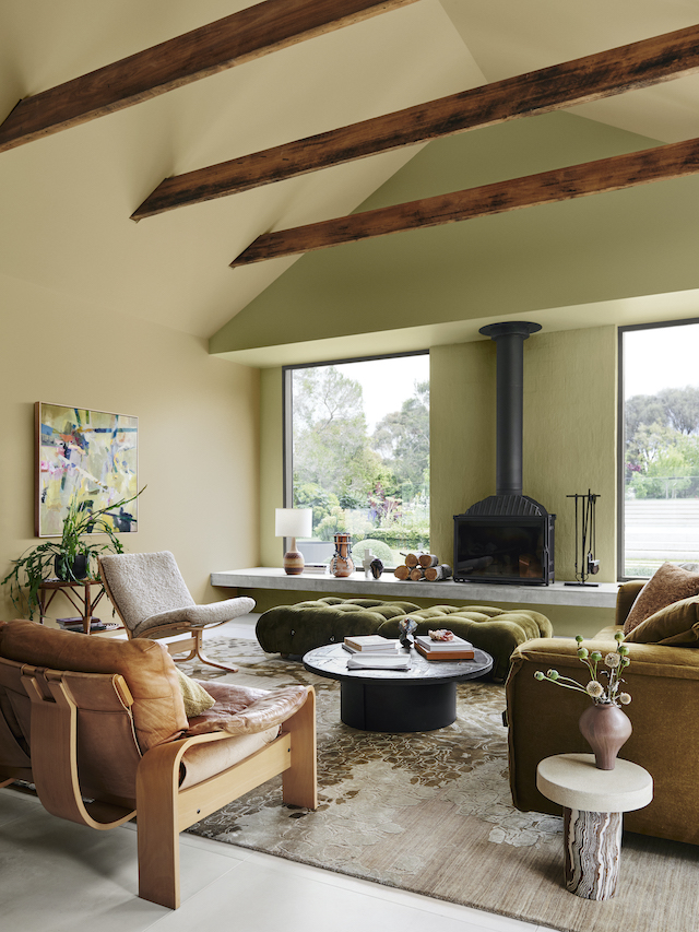
Walls and ceilings: Dulux Pataua Beach, Fireplace wall: St Bathans

Walls and ceilings (living room): Dulux Pataua Beach, Walls (front): Mt Inaccessible


The Connect palette speaks to our growing passion for craftsmanship, sustainability and living more simply, and creates the relaxed and cocooning feeling we crave from our homes in the autumn months. Further enhanced by furniture art and objects, these include beautifully worn vintage pieces, such as a '70s leather sofa and slate coffee table, sitting comfortably alongside newer future family heirlooms, such as the classic Camaleonda upholstered ottomans and a deep-seated, contemporary sofa by Jardan in a tobacco linen. Tactile, natural materials are layered, including raw timber, rattan, worn leather, heavy linen fabric, shearling, and stone, all drawn from the same curated colour palette to create a cohesive look. Handmade ceramics displayed on the fireplace ledge and a mix of botanicals and dried flowers emphasise the earth-drawn theme, while an abstract artwork reflected the dynamic colours in the landscape.

Walls and ceilings: Dulux Pataua Beach, Fireplace wall: St Bathans
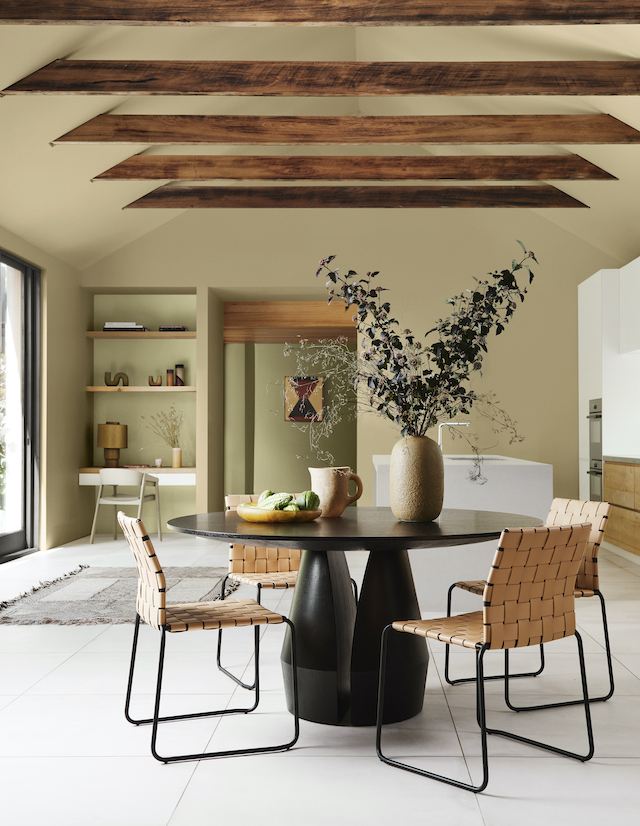
Walls and ceilings: Dulux Pataua Beach, Entrance (through opening) and behind shelves: Dulux Gentle Annie

Experimentation with these warm earthy colours will help your spaces feel intimate, warm and inviting this autumn. By using the Dulux Connect palette, you can create a calming, earthy vibe that's perfect for laid-back entertaining and family gatherings as the weather cools, blurring the lines between inside and out.

Walls: Dulux Pataua Beach, Entrance (through opening) and behind shelves: Dulux Gentle Annie


To learn more about Dulux’s Colour Forecast 2023 visit www.dulux.co.nz.

Image Credits

Styling: Bree Leech
Photographer: Lisa Cohen


AD / This is a Paid Partnership post. I only work with products I love and all opinions are my own. For more information please visit my About Page.

VIEW STORY
Pin ThisShare on Tumblr

Christmas Styling: Elegant, Calming and Sensory

12.07.2022

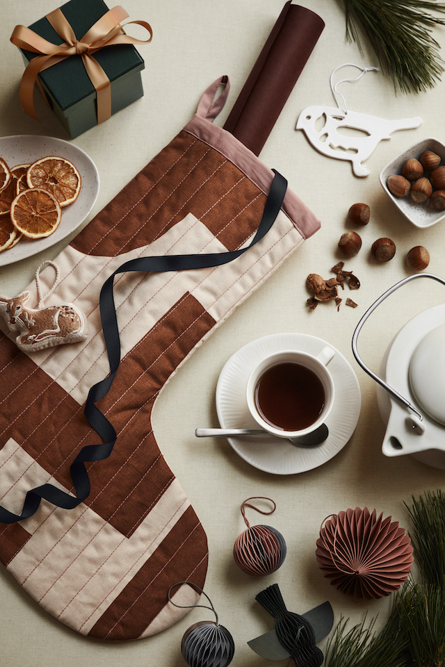
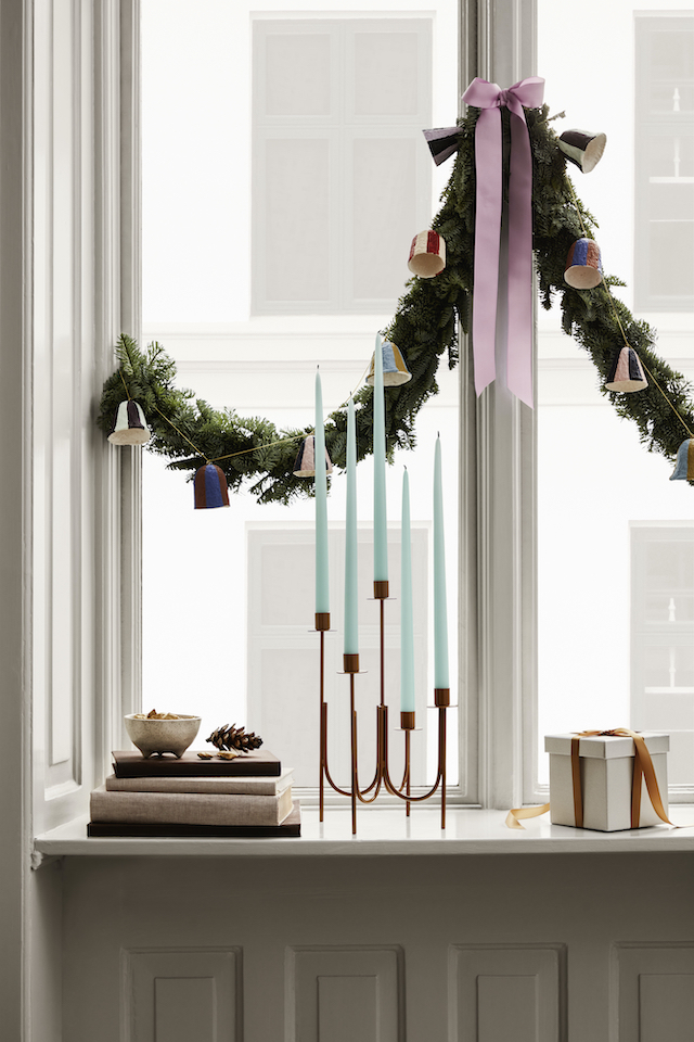
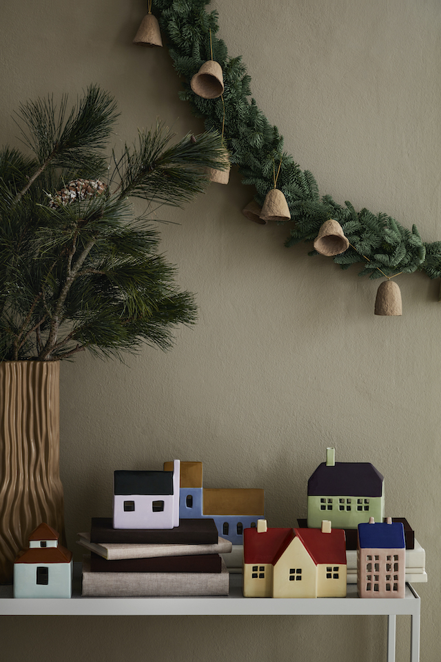
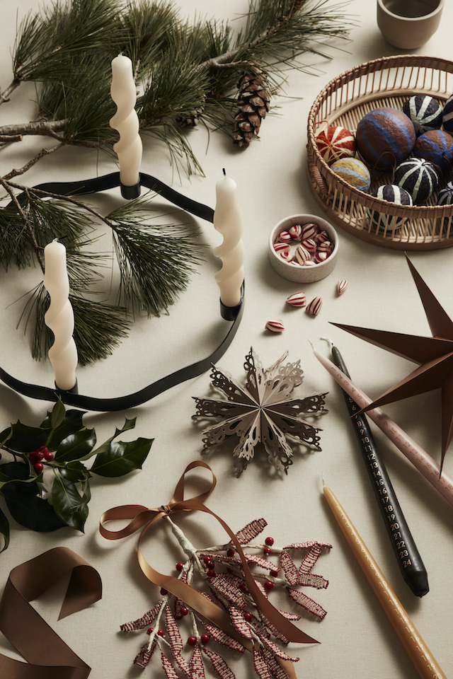
I’ve finally started bringing out the Christmas decorations today, and the tree will going be up soon. Looking back at previous years, I came across this blog post I wrote in the lead-up to Christmas 2020. Still relevant today, I thought it was worth revisiting for those who are in need of some festive inspiration! I’ve updated it with fresh imagery, and just as before, there are plenty of Danish brands in the mix. 


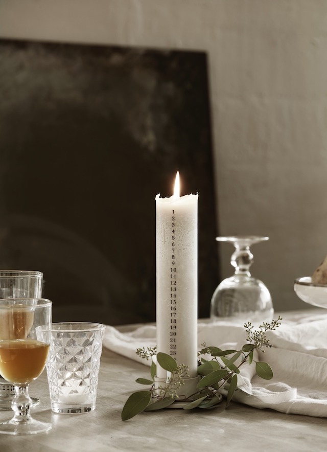
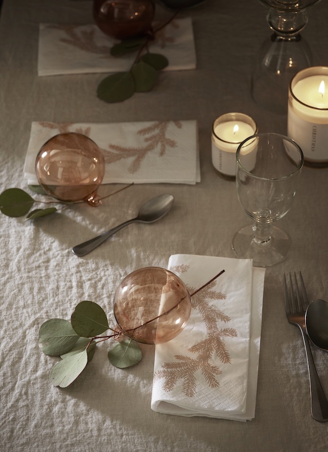
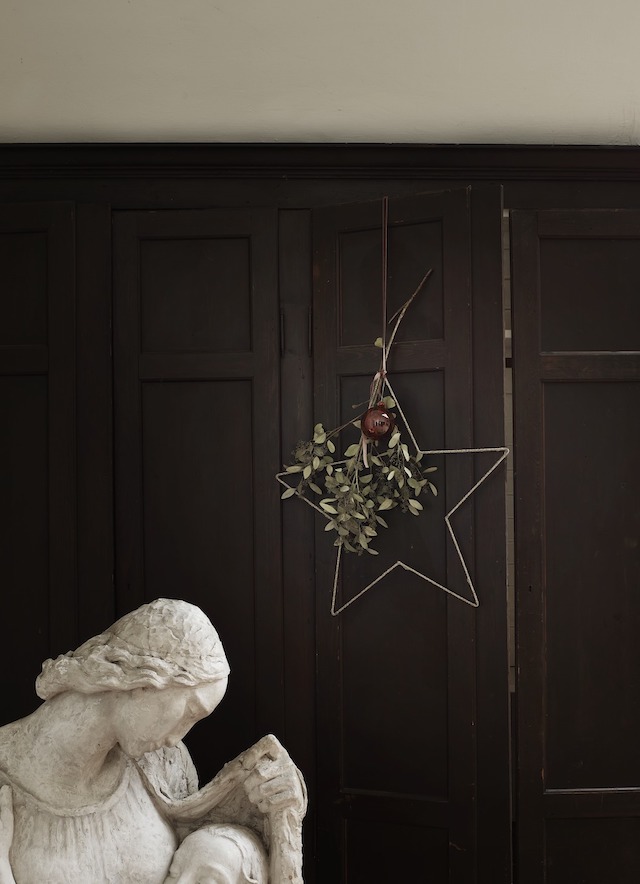
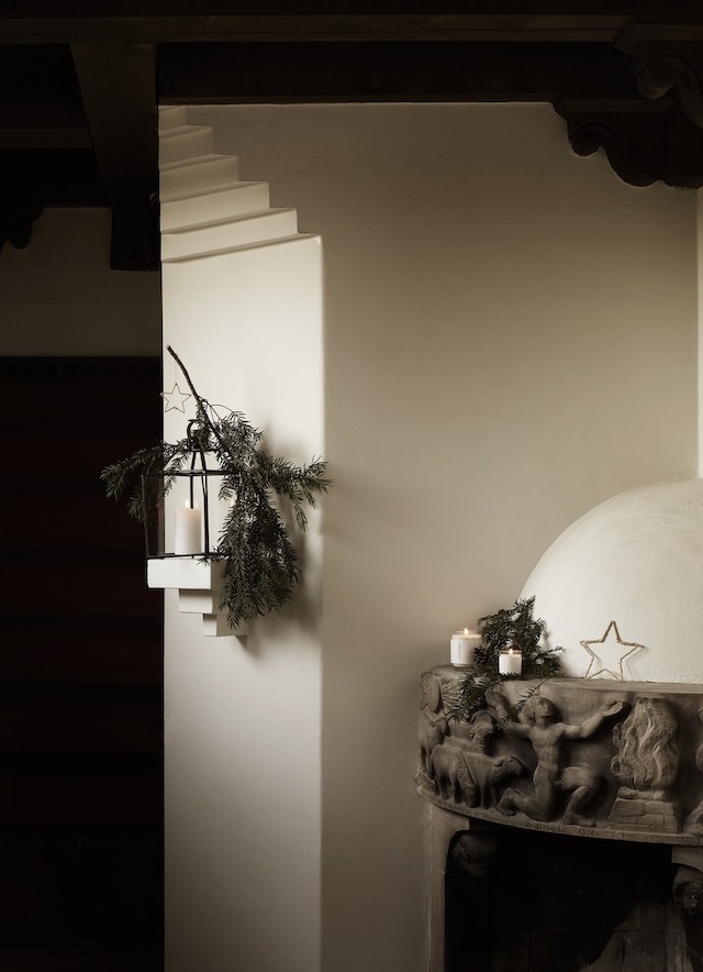
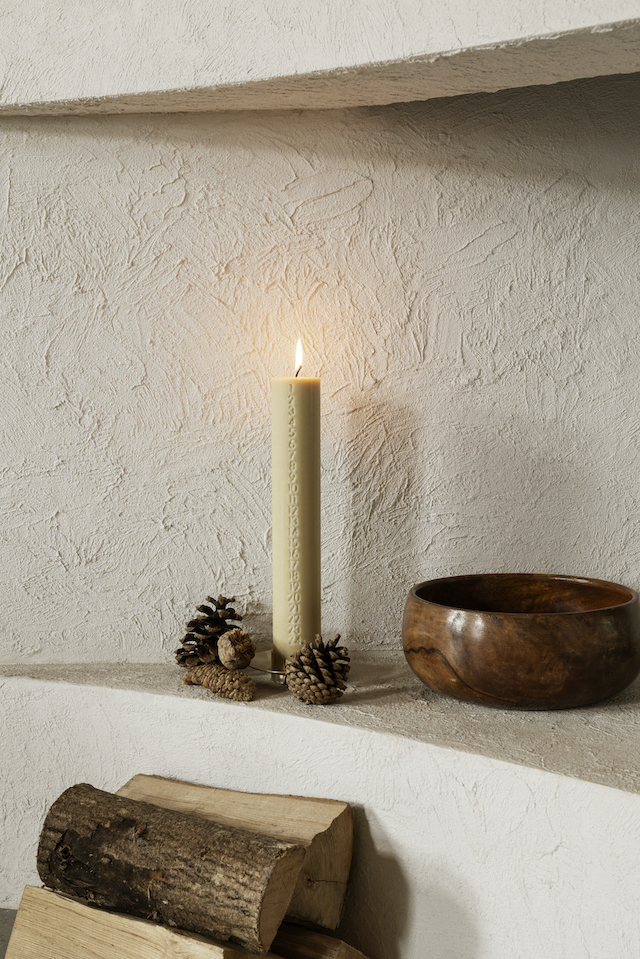
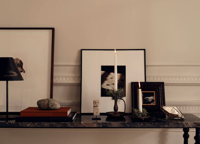
I naturally gravitate to the Nordic countries when it comes to Christmas decorating. Even though our seasons are the complete opposite and we're more likely to be chasing a cool breeze than snuggling up warm, we can still take cues from these minimal, nature-inspired vibes from the other side of the world. Subtle festive touches with an emphasis on organic forms against a muted backdrop, the overall feeling from Danish brand Tine K Home is simple, soft and sensory.


Timeless decorations with a relaxed, organic feel courtesy of Danish favourite Tine K Home with styling by Pernille Vest and photography by Mikkel Adsbøl

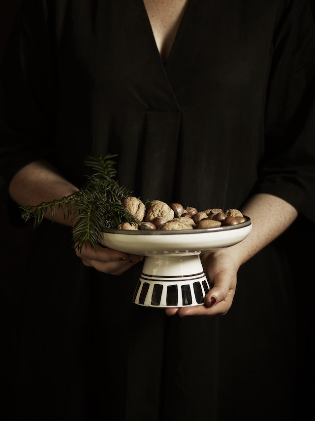
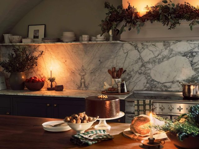
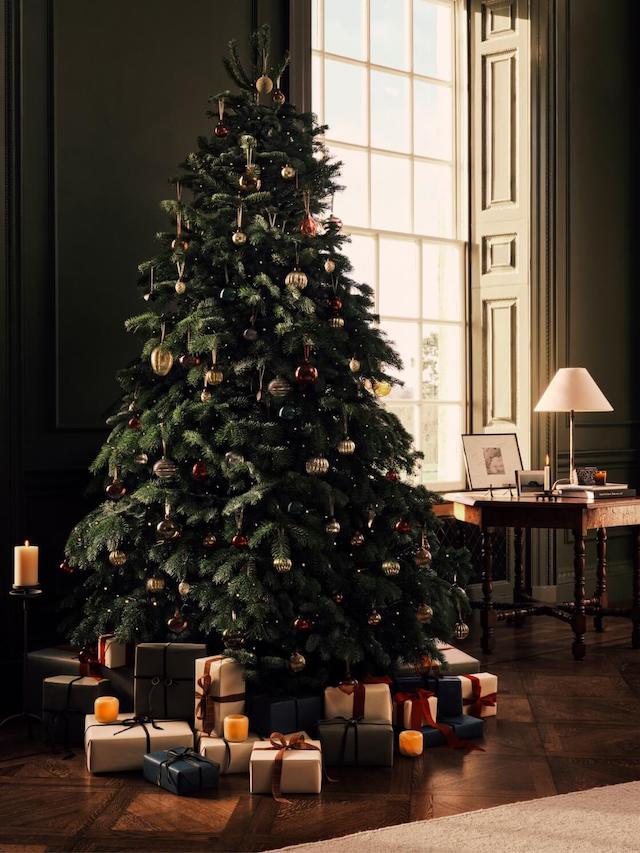
Every year I add a few new decorations to our collection, and I love bringing them out every Christmas. It adds to the sense of tradition and is all part of creating those special family memories. I love making the most of the high ceilings in our living room and having a generous-sized real tree (the Nordic Spruce is my favourite), but a couple of years ago I opted for a faux tree due to allergies. For compact spaces, small trees are perfect, and if space permits, you could even have both, displaying a smaller tree on the dining table, on a console or shelf. Alternatively, get creative and forage outside for a big branch to decorate, for a natural, minimalist look.


I'm still inspired by this Chrismas inspiration from the 2020 Broste Copenhagen campaign with styling by v y f f and photography by Maja Karen
 
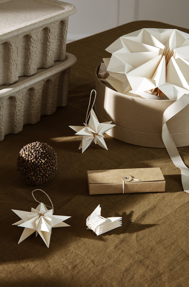
Paper and wood decorations are my favourites for the tree. Every year Danish brand Moebe offers free download templates so you can make your own paper decorations. You can access the current and past designs here. I also love making my own wreaths. Traditionally Christmas wreaths are displayed on the front door, but they can also provide a beautiful festive touch inside your home. A fun DIY using simple greenery and white flowers, I've also made them in the past with dried flowers. Anything goes!


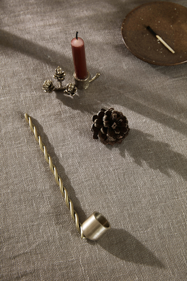
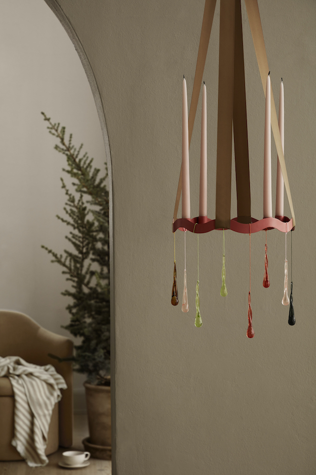
Danish brand ferm Living provides beautiful Christmas inspiration year after year


' A Sense of Christmas' by Zara Home demonstrates how to create a sophisticated space with a touch of tradition, elegance and calmness. Creative direction and interior styling by Amanda Rodriguez / Photography by Harry Crowder 


Nordic with a playful twist from Broste Copenhagen  

VIEW STORY
Pin ThisShare on Tumblr

Autumn with Dulux | Sun-Baked Neutrals to Warm the Soul

2.15.2021

This Autumn Dulux brings into focus the Nourish Palette - one of three trend colour palettes identified in the 2021 Dulux Colour Forecast. With sun-baked neutrals that provide gentle warmth to interiors, the mix of earthy tones such as buff, ochre and olive, together with a soft neutral white exudes a sense of calm.


Colours: Dulux Kauri Cliffs, Kūaotunu and Haast Half
Artwork: Looking Down from Above #4 by Ali Mcnabney-Stevens

“Most of us are still spending time at home, and after a tough year, we’re all ready for a change,” says Davina Harper, Dulux Colour Specialist. “Colour can add interest to every corner of your home, breathing new life into tired spaces and helping you fall back in love with where you live.”

Describing the colours of the Nourish palette as being like a gentle hug - warm, comforting and grounding, Davina says "There’s a lightness and optimism to the palette that speaks of better times ahead. And with their soft, natural feel they’re just the thing to surround yourself with if you struggle to switch off after a busy day working from home.” 

The Nourish colours are versatile too, pairing easily with the soft whites and neutrals that many of us already have in our homes, and they suit both traditional and contemporary architecture. Davina suggests combining them with raw textures, honey-toned timbers and plenty of natural light for a look that feels fresh and welcoming.

To show you just how easy it is to integrate these upbeat hues into your interior, stylist Bree Leech transformed an open-plan living/dining space in a traditional home using the Dulux Nourish palette.


Before 

After
Colours: Dulux Kauri Cliffs, Kūaotunu and Haast Half
Artwork: Looking Down from Above #4 by Ali Mcnabney-Stevens

“The home is bathed in natural light and the owners have some great furniture – through this mini makeover, I aimed to add another level of warmth and character to their quite neutral interior,” says Bree. “There were also some charming period features we wanted to bring out using colour, including sash windows and a decorative fireplace. 

“The Nourish colours curated by Dulux are a fresh spin on the rich, saturated colours we normally associate with autumn – think the soft tones of freshly fallen leaves. And they work so well here, adding warmth without sacrificing the light and open feel,” she says.

To keep the makeover short, sweet and economical, Leech reused many of the existing pieces in the room and focused her attention on the clever integration of colour. “Paint is your best friend if you’re looking for big impact with minimal outlay. And it’s quicker than you might think – a makeover like this could be done in a weekend,” she says.


Colours: Dulux Kauri Cliffs

Bree Leech chose Dulux Wash&Wear in Kauri Cliffs – a soft biscuit shade – for the walls and painted the feature alcoves beside the fireplace in a tonal shade of Dulux Kūaotunu. “This tonal combo makes the space feel more soothing, and draws you in,” she says. “Adding colour to the walls also allowed the minimalist pendant lights over the dining table to be a stronger feature – they now contrast against the new colour. We used Dulux Wash&Wear in a Low Sheen finish, so there was some subtle illumination.”

A couple of coats of Dulux Aquanamel Gloss in popular Haast Half were used to highlight the fireplace, cornices and woodwork,” she says.

Leech worked with the foundation pieces already in the room –the sofa, rug and dining table. She swapped out the classic dining chairs for something more dramatic; curvy upholstered styles in burnt terracotta with a 70s vibe. Chubby occasional chairs in olive and caramel leather add punch and provide an irresistibly comfy spot to sit.

Before 


After
Colours: Dulux Kauri Cliffs, Kūaotunu and Haast Half
Artwork: The Magic Sandhill by Mel Obst

Autumn Styling Tips


Texture time
Style an earthy palette like this with raw textures and natural finishes.

Choose the right white
Dulux Half Haast is a popular soft white with a subtle beige undertone that work best in open-plan rooms with plenty of natural light.

Consider the view
When you’re layering tonal colours like this, step back and view the room as a whole before deciding what to apply where.

Add one or two statement pieces in richer hues
This grounds your palette and creates a sense of balance.

Avoid clutter
To keep the look calm and open, leave plenty of breathing space around furniture and décor items (this also helps show off their beautiful shapes).


Colours: Dulux Kauri Cliffs, Kūaotunu and Haast Half

To learn more about Dulux’s 2021 Colour Forecast visit Dulux

Styling by Bree Leech / Photography by Lisa Cohen 

AD / This is a Paid Partnership post. I only work with products I love and all opinions are my own. For more information please visit my About Page.

VIEW STORY
Pin ThisShare on Tumblr

Stay Collection 2021 by Tine K Home

1.19.2021

At this time of year in New Zealand when we’re enjoying the hottest months, I’m always drawn to dreamy, summer escapes. Danish brand Tine K Home has launched their latest catalogue, and it’s providing the perfect inspiration. Founded in 1999 by Tine Kjeldsen and her husband Jacob Fossum, the brand reflects Tine’s bohemian aesthetic and elegant simplicity and is inspired by her love of travel and nature. The Stay Collection 2021 consists of home decor, textiles and furniture across a range of dusty colours and raw materials. Styled by Pernille Vest against a backdrop of textural walls, stone flooring and breezy outdoor spaces at the incredible Villa Cardo in Puglia designed by Studio Andrew Trotter, here's a look at some of the beautiful new imagery. 


The new collection features a range of indoor and outdoor furniture in bamboo, wood and rattan. For the interior, these pair beautifully with the sofas - the versatile modular collection in fresh white and the sofasoft in IcaSand - alongside a range of beautiful lighting and textural rugs. The home deco collection features new travertine cubes and boxes, handcrafted glazed ceramics pieces that include rounded forms and earthy clay vessels, along with coloured glassware in soothing grey and amber.


Textile pieces for every area of the home are offered in crisp white and soft hues including sky, oat, grey, sand and choco. An extensive range of woven baskets provides plenty of storage options, while adding a summery textural element to any space.


Styling: Pernille Vest / Assistant: Henriette Schou / Photography: Mikkel Adsbol 

Images via Tine K Home Press

VIEW STORY
Pin ThisShare on Tumblr
 

T.D.C© Theme by Blog Milk