Copyright The Design Chaser 2012. Powered by Blogger.

Search Bar

Social Media

Text Space

THE DESIGN CHASER

The Pad: A Japanese-Inspired Sanctuary by SHA

8.10.2023

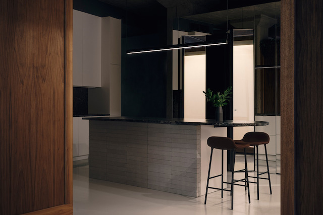
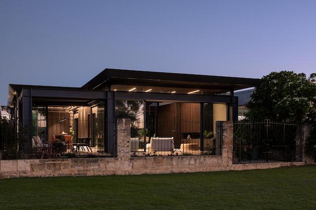
Suzanne Hunt Architect (SHA) was approached by previous clients, a couple in their 70s, initially seeking to renovate their 'Mediterranean-style' split-level strata unit in South Perth.  Following a two-year process of preparing design drawings for several options, including both a small and large reno, and as conversations unfolded about their evolving requirements and the desire to age in place, the project transitioned into a new build. The culmination of this transformation is revealed as The Pad, a beautifully detailed, Japanese-inspired, single-story home. Melding intentionally understated architecture with a refined material palette of steel, timber, and polished plaster, the result is an exquisitely designed, inviting sanctuary.


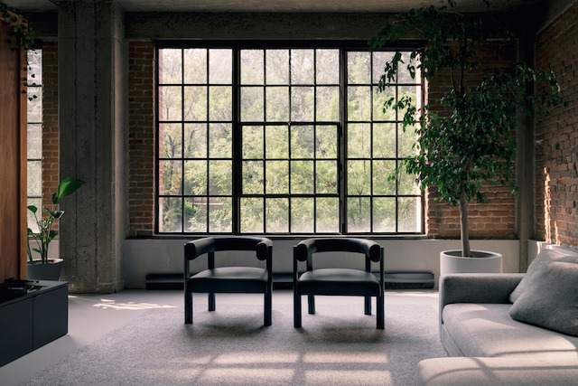
Located on the Swan Canning River Park, the site provides access and views over the foreshore. Passionate gardeners, with a love of birdlife, the owner's brief was for an unpretentious and sustainable, passive-designed, weather-responsive two-bedroom home that connects to nature and views while providing privacy, security, accessibility, and flexibility for gatherings. Additionally, strict strata by-laws restricting height, aesthetics, access and materiality needed to be adhered to.


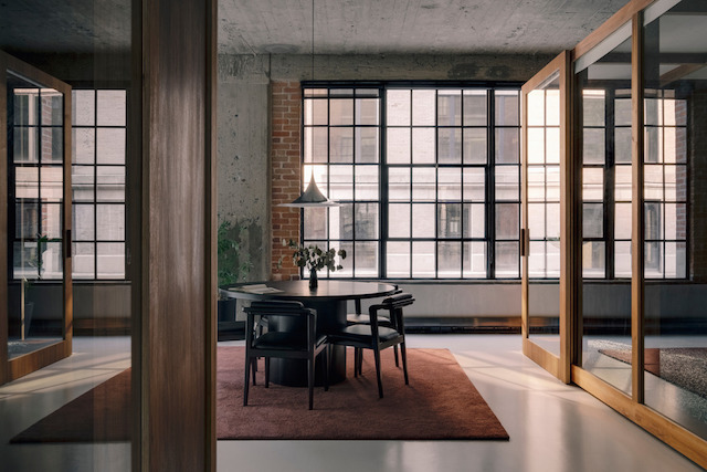
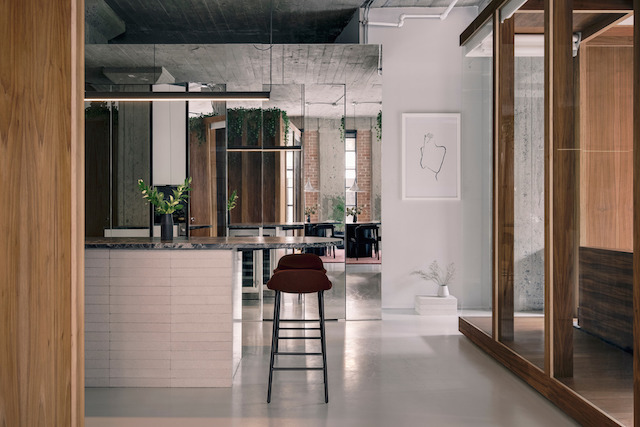
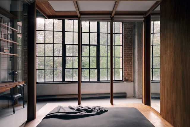
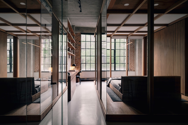
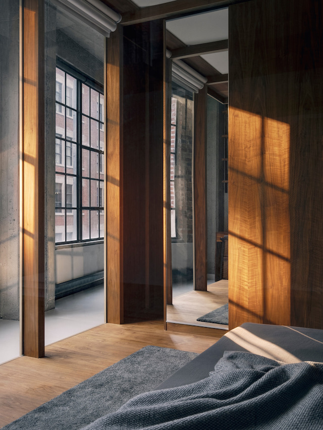
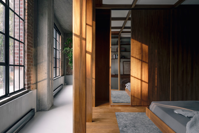
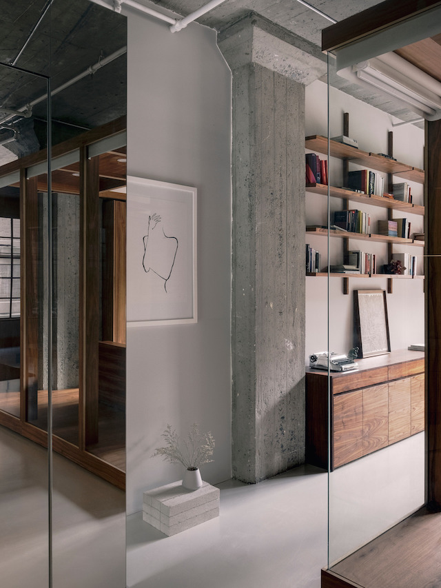
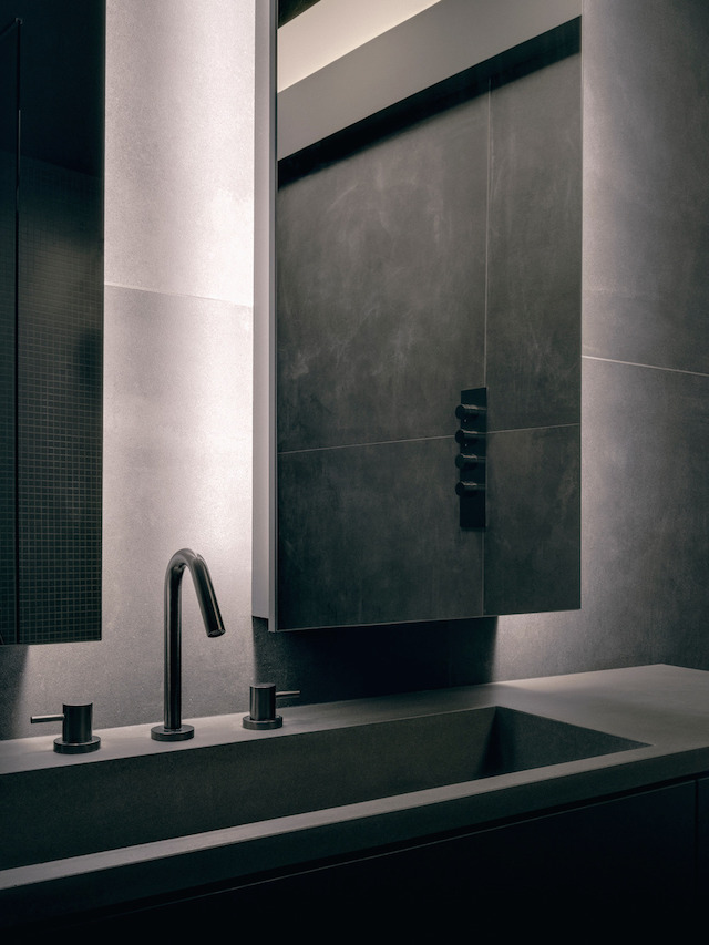
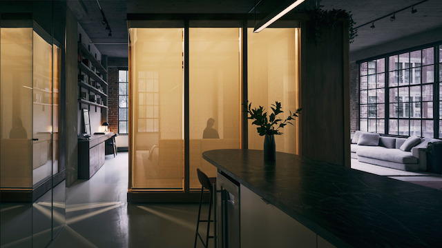
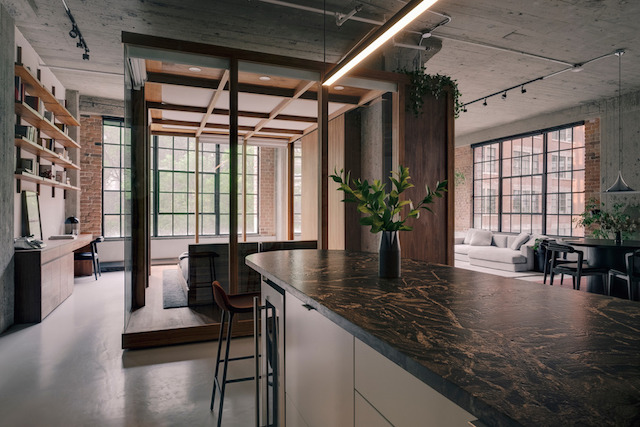
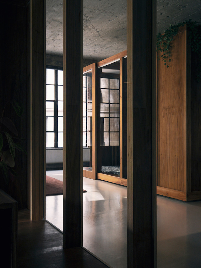
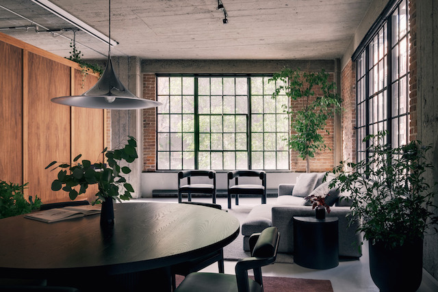
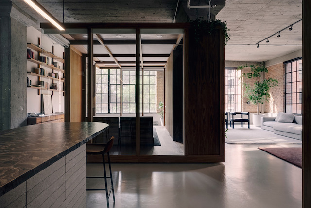
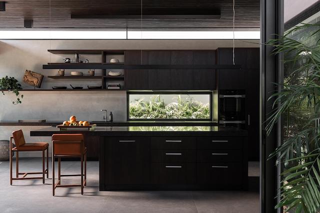
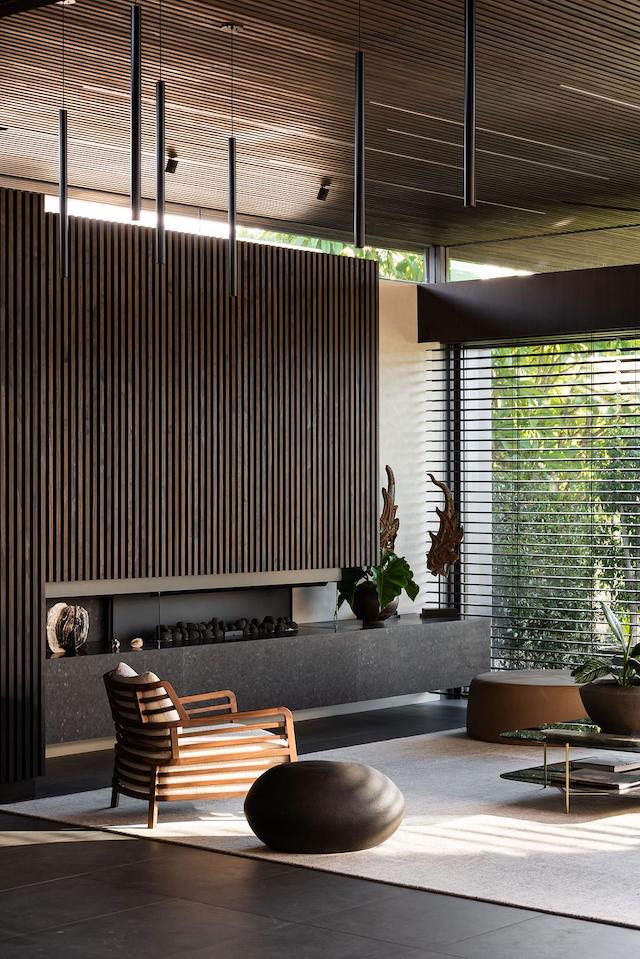
Reflecting SHA's holistic architectural approach, The Pad is designed to visually recede while seamlessly integrating with the surrounding landscape. On the southern side, dark-stained timber battens artfully conceal the garage, merging with polished plaster walls that guide the way to the Japanese-inspired entry door via porcelain tiles. To the north, an exposed steel frame surrounds full-height sliding doors that not only open to unveil the breathtaking views but also frame them. Adjacent to this, glazed doors and a louvred-roof alfresco area can be fully opened, effortlessly bridging indoor and outdoor spaces with seamless transitions. This thoughtful arrangement effectively doubles the available entertaining area. Meanwhile, all external doors facing north are equipped with recessed remote-controlled blinds, serving both as protection against the sun's glare and as measures for security and privacy. Additionally, strategically placed high-level windows throughout the house not only mitigate the impact of any limiting side setbacks but also grant views of the expansive sky.


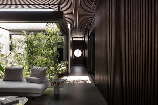
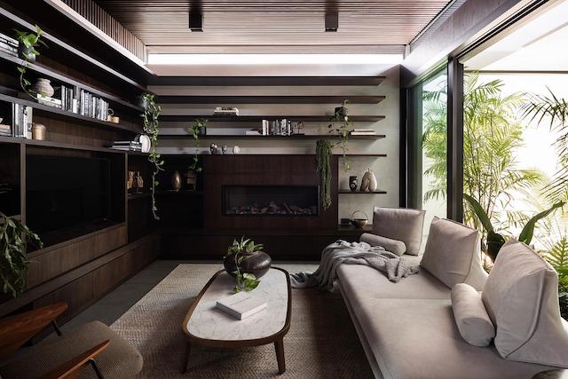
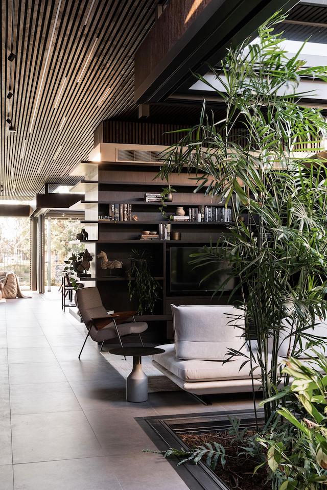
With landscaping playing a pivotal role, The Pad features three internal courtyards strategically dispersed throughout the home. These serve to create a sense of separation among the rooms, while also establishing physical and visual connections through lush landscaping. Each courtyard provides security, is shielded from insects, and is shaded with remote-controlled horizontal blinds. These blinds serve the dual purpose of diffusing natural light into the rooms, ensuring cross-breezes, and views to the river and city reach deep into the home.


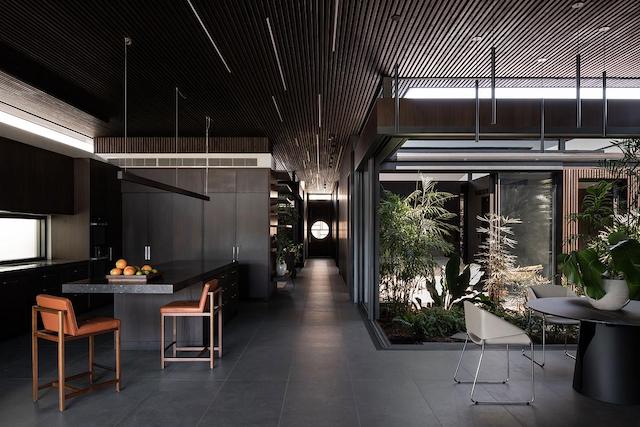
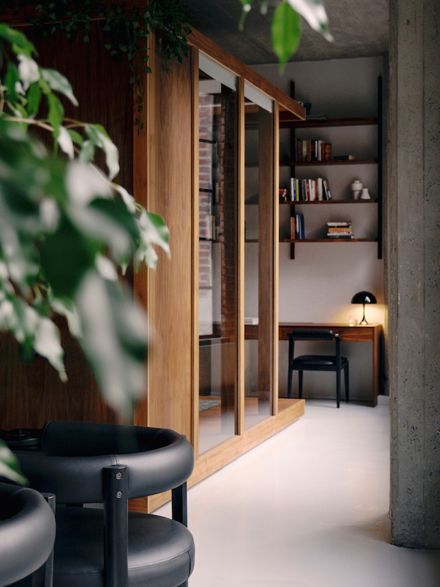
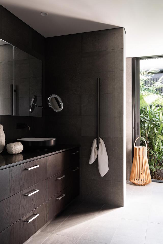
The design incorporates Japanese-inspired operable glazed walls, doors, and retractable insect screens that seamlessly slide apart, blurring the line between inside and out. Vulcan timber battens on the walls and ceiling, offset by polished plaster, create a sensation of walking along a bridge through a forest towards distant wetlands. Sustainability was a priority, using local materials like thermally modified pine battens, Low-E glazing, Australian-made aluminium doors/windows, and porcelain flooring tiles. Onsite, 5.5 kW solar panels and batteries store renewable energy, while dedicated bike storage encourages riverfront bike path use for leisure and local shopping.


This design demonstrates that it’s possible to create delightful and sustainable infill housing in spite of multiple constraints and challenges imposed by strata by-laws and regulations. By prioritizing access to light and views – and connections to nature – The Pad provides a welcoming residence for the owners to enjoy their retirement and entertain family and friends.


Credits

Architecture: SHA
Project Team: Suzie Hunt, Principal Architect and Catherine Lee, Senior Associate
Photographer: Dion Robeson
Styling: KT Crocker  

VIEW STORY
Pin ThisShare on Tumblr

Rue de la Gauchetière Loft by Future Simple Studio

11.02.2021

The Rue de la Gauchetière project is a thoughtful apartment renovation in Canada by Future Simple Studio. Located in a one hundred year-old heritage building near the Old Port of Montreal, the loft has been updated with an elegant and unexpected architectural intervention that accommodates flexibility and togetherness for family living, while celebrating the space’s unique industrial character.


With flexibility and light as top priorities, Future Simple Studio created a simple and adaptable concept — a box inside the box — with two glazed convertible wooden volumes. Thoughtfully arranged within the concrete space, these are designed as bedrooms and are used as spatial tools to organise the surrounding functional areas of the home including the kitchen, living, dining and study, as well as spaces for reading and exercise. At once object and architecture, each is crafted as a bespoke kit of parts that includes everything from ceiling panels and mullions, to flooring and furniture. The bedrooms are also fitted with a series of automated blinds — both sheer and blackout — that transform them from open spaces to semi or fully private rooms. In the evening, when the sheer blinds are drawn and the lights are on, both rooms appear as floating lanterns in an open plan space, creating a dream-like atmosphere that defies the traditional image of home, while providing all the necessary comforts.


Punctuated with bespoke built-ins and furniture designed by the studio, the apartment features a poured concrete bathroom sink top, custom bookshelf and desk, and convertible bed frame (to name a few). A tactile material palette inspired by the building’s original character can be seen throughout. Walnut plywood structures echo the earth tones of the brick walls, warm grey flooring and textiles pick up on the concrete, while glass and mirrors emphasize the airiness of the space with a constant play of light and reflection. The ample addition of greenery, including vines and an 11-foot outdoor tree, adds a surprising and soothing natural dimension to the loft’s downtown context.


With its innovative architectural elements, open plan living, versatile bedrooms and natural palette, the Rue de la Gauchetière loft offers a new take on city living for a young family - one that is both beautiful and practical.   


Architect: Future Simple Studio
Architecture Team: Christine Djerrahian
Construction: Construction Père en Fils
Photography: Felix Michaud

VIEW STORY
Pin ThisShare on Tumblr

Styling and Journal Feature with Wallace Cotton

3.03.2021

Last year I began working with family-owned New Zealand bed linen and homeware business Wallace Cotton. With a focus on beautiful designs inspired by nature, the gentle pace of our seasons, and the relaxed lifestyle of living in New Zealand, Wallace Cotton has been in homes worldwide for more than 14 years. Their range of collectable products are made from natural materials with enduring quality and attention to detail, all while being kind to the planet. To coincide with the Mid-summer campaign, I also sat down with Wallace Cotton to answer a few questions for their journal. 


Among other things, I talk about how I got into interior design and what I love about my role, what a typical day on location with Wallace Cotton is like, and my tips for creating a beautiful bedroom. 


Styling Michelle Halford - Studio TDC / Photography by Jae Frew 

You can read the interview here

Visit Wallace Cotton to see all the new collection designs, including those featured above. 

Additional pieces in the shoot, with thanks:
Armadillo Malawi rug (first and last image), Serengeti rug (images 3 &4) The Ivy House
Louis Poulsen lamps designed by Arne Jabobsen (images 1 & 3) Cult NZ
Sike Monet chair (image 3), Broste Copenhagen vase (image 4), and Triboa Bay Pena bedside table (last image) May Time 
Flowers (first image) Bloom Social 

VIEW STORY
Pin ThisShare on Tumblr

Dulux Colour Forecast 2021

9.04.2020

Surrounded by unfamiliarity, we are currently facing a ‘new normal’, far removed from our general comforts of connection and sociality. In a time where our homes have become a core hub of activity, we are increasingly using technology to connect with the outside world. At the same time, we are yearning for moments to disconnect from the constant stream of information to reset, reflect and recharge. This year, The Dulux Colour Forecast for 2021 is expressed through three tonal palettes that prioritises natural colours and textures for comfort and security, with moments of stronger colour to brighten our outlook and wellbeing.

Nourish Mood Board

To show my interpretation of the inspiring new colour palettes, I created a mood board for each. This was such a fun task that gave me the opportunity to really think about how I would combine the colours if I were to bring an interior project to life. For each mood board I selected three to four key paint colours, which I used for the background and smaller accents, some of which I first moulded in white clay. I then drew inspiration from each of the themes, to bring together different materials and natural elements. I’ve gone into more detail below, starting with my favourite palette, Nourish.

— Nourish —

Nourish Mood Board 

Whilst most of us are required to experience the world from within the four walls of our home, we are facing digital saturation at its most extreme. Craving time and space away from our screens, there is a renewed appreciation for nature and rituals of self-care to help soothe the mind and create an aura of calm and sense of wellbeing. The Nourish palette plays into this longing for natural beauty and earthly connection with biophilic hues that really speak to me. Starting with a warm, neutral backdrop in Dulux Kauri Cliffs, I added touches of sand, tan, mossy green and tumeric hues. One of my favourite colours is Dulux Pukekawa, a soft yellow that takes me back to my childhood. Yellow was my favourite colour and when I was given the exciting job of choosing a paint colour for my bedroom, it was very similar to this. I love how the colours connect us to nature, inspiring us to fill our homes and workspaces with plants and blooms. The tactility of materials and raw textures provide a level of physical comfort to the touch, whilst the round-form surfaces and soft shapes offer visual relief to encourage revitalisation.

Nourish Mood Board 
Background: Dulux Kauri Cliffs
Cubes: Dulux Morocco Tan
Clay forms: Dulux Sandymount and Pukekawa

— Reset —

Reset Mood Board

In the wake of our ‘new normal,’ a level of adaptability, positivity and resilience is at the forefront of our minds as we shift to a slow-paced lifestyle, far removed from the adventure and excitement we once thrived on. Reflecting on what is most important to us, we draw closer to our families and local community. The Reset palette reflects our renewed energy and desire to brighten our outlook as we adapt to home life. Subtly inspired by the 70s with uplifting hues of blue-green and energetic reds that offset whites and neutrals, I picked out two key colours to highlight these contrasts: Dulux Muriwai as the neutral backdrop, and Dulux Vixen, a deep red. Touches of soft pink soften the overall effect and I love how this theme speaks of meaningful combinations with objects and mementos from past travels and pieces that are durable and generous in shape and form. 

Reset Mood Board
Background: Dulux Muriwai
Round form: Dulux Vixen
Small objects: Dulux Prebbleton


— Retreat — 

Retreat Moodboard

Our idea of what home means has evolved. What was once a place for solace and recuperation is now our vehicle for daily life - from sleeping, eating, working to exercising. As our work-life boundaries continue to blur, we delve deeper in search of balance, restyling our spaces to accommodate our flexible lifestyle. We seek out the security of well-loved DIY traditions like cooking, baking and crafting to help us feel grounded and present. The grey, blue and brown hues of the Retreat palette were lovely to work with here. On a backdrop of timeless grey - Dulux Franz Josef Quarter, I layered Dulux Teahouse and Dulux Meerkat. The stormy hues channel tranquility, signifying better times to come, whilst essential whites and burgundy feed our sense of the familiar and tradition. Drawing on nostalgia to create that sense of familiarity and refuge we crave, I incorporated rustic ceramics and textural fabrics.

Retreat Mood Board
Background: Dulux Franz Josef Quarter
Large card: Dulux Teahouse
Cubes: Dulux Meerkat

All tiles are from Tile Space and textiles are from Martha's Fabrics, with thanks. 

Styling and photography by Michelle Halford /TDC

To learn more about Dulux's 2021 Colour Forecast visit www.dulux.co.nz.


AD / This is a Paid Partnership post. I only work with products I love and all opinions are my own. For more information please visit my About Page.


VIEW STORY
Pin ThisShare on Tumblr

Long Residence by Pernille Lind Studio

7.20.2020


Born in Denmark, Pernille Lind grew up travelling the world. Now based in London, where she has lived since 2013, the half-Thai interior designer’s global upbringing has shaped her creative approach, which is influenced by Scandinavian design aesthetics mixed with Asian decorative and material inspirations. Specialising in hospitality and high-end residential projects worldwide, Pernille Lind Studio was commissioned to work on the refurbishment and interior design of a 5-bedroom Colonial revival house located in the historical Frank Lloyd Wright district, of Oak Park, Chicago Illinois. Built in 1920 by architects Tallmadge & Watson, the house was in sound condition, but lacked what was needed for contemporary family living. By opening up key spaces, a central area for the family was created with an elegant dining area and stunning new kitchen. Designed to suit the avid chef, with all modern appliances, central working island and pantry store, it features striking marble benchtops paired with warm beige cabinetry. The calming colour palette and materiality continues throughout the home.


Extending the home's original characteristics with further European-inspired elements, the final styling and personal touches were sourced from Chicago's plentiful design stores and antique shops, with some wonderful additional pieces found in the greater Michigan area. Working with local manufacturers and craftsmen the studio designed all the bespoke joinery for wardrobes and bathrooms. Knocking down walls between a former dressing room and smaller bathroom, a luxurious new ensuite was created for the master bedroom.


Reflecting the owners’ travels and personal style, the home is a now a beautiful, calm haven. 

Photography by Stoffer Photography

See the full house tour at Pernille Lind Studio


VIEW STORY
Pin ThisShare on Tumblr

The New Home of ferm LIVING

7.06.2020

Last month, Danish brand ferm LIVING opened the doors to their first ever Boutique and Showroom in the heart of Copenhagen. Nestled between picturesque canals and quirky houseboats in Christiania, their inspiring new home is located inside an historic building that dates all the way back to 1777. Spanning the entire 450m² ground floor space, here you can shop the entire ferm LIVING collection, as well as a curated selection of vintage curio, plants, coffee table books and other accessories for the home.


“This is a thrilling milestone for ferm LIVING. It has always been a dream and a goal for us to have a space in which we can welcome the public into our ferm LIVING universe. To be able to do that in such a beautiful, historic location in the heart of our beloved hometown is very exciting for us.”

—Founder and Creative Director Trine Andersen


The expansive space features beautiful architectural detailing including high ceilings, arched windows, brick walls and raw beams. A sculptural wonderland peppered with fresh greenery, I love how it has been divided into rooms, offering endless inspiration for every area of the home. I can never leave Copenhagen without bringing home something from the ferm LIVING collection, so this new space with everything under the one roof is a dream concept. 


The new home of ferm LIVING is located at:
Kuglegårdsvej 1-5
1434, Copenhagen K

Images via ferm LIVING 

VIEW STORY
Pin ThisShare on Tumblr
 

T.D.C© Theme by Blog Milk