Copyright The Design Chaser 2012. Powered by Blogger.

Search Bar

Social Media

Text Space

THE DESIGN CHASER

Pretty Pastels + Affordable Styling Tips

3.04.2015

I have some beautiful styling inspiration today courtesy of Dutch magazine vtwonen. Not available to buy in NZ, this came via their website which is definitely worth bookmarking. The styling centres around a vintage-industrial look softened with pretty pastel colours like powder pink and lots of soft green hues, teamed with white and grey. There are many gorgeous pieces of furniture and homewares, as well as affordable styling tips to help you bring these ideas to life. I've picked out a few to share with you.  

You know how much I love shelving units, and this affordable white cabinet works so well against the soft pink wall. The spacious shelves are perfect for displaying a mix of homewares in various shapes and sizes, in complimentary pastels and pale wood. There are so many lovely things here, like that mint watering pot. Gorgeous!

A great way of creating a mixed gallery wall, the beautiful artworks by Hannah Lemholt, from Couleur Locale come with budget friendly-clips for hanging, so you can save money by not having to frame them. The simple bench seat provides a low-level space for adding more artworks in different sizes, either leaned up against the wall or attached to the wall above. Small objects and books add to the relaxed, homely feel. 

With my growing collection of indoor plants, I sometimes think I could do with a designated space just to care for them all! The vintage cabinet is placed near a window to give plants on top a good dose of sunlight, and the trestle table would provide a great little work area for watering.

A panel behind the beautiful Muuto Rest Sofa covered in marble wallpaper creates an amazing feature wall. The accessories and the side tables are all budget items, not that you'd guess! I like the way the little vintage table below the window has also been given a coat of marble wallpaper for a new lease of life. 

The bed here features a clever custom-made base that serves as a bedside table. A mix of affordable and designer linen, throws and graphic cushions help to create a luxurious layering of textures. 

Thanks to Elv's for bringing this article to my attention. To see it in full, including a comprehensive list of product details take a look here

Source: vtwonen March 2015 | Photography Jeroen van der Spek | Styling Cleo Scheulderman

VIEW STORY
Pin ThisShare on Tumblr

A Touch of Pink

4.11.2014

The beautiful bunch of ranunculus below caught my eye over on Nordic Leaves yesterday. One of my favourite types of flowers, I usually look for white when shopping for blooms for home, but the addition of a few bright pink stems really makes them pop!


When it comes to homewares I love muted shades of dusky pink or nude. The sofas below have a touch of coral which is really eye-catching and fresh. 


01 | 02 | 03 | 04

Pale pinks are lovely paired with grey, and they add softness to the harder surfaces of ceramics, marble and concrete. Here are a few pieces, currently on my wishlist. 


01 Lovatt Plates by Serax
02 Nest Tables by Faerid
03 Diamond Print by Oy!
04 Lara Melchoir Stone Bangle
05 Fuji Vase
06 Pink Felt Garland

Have a lovely weekend everyone. x

VIEW STORY
Pin ThisShare on Tumblr

Stylist Laura Fulmine

10.30.2012

I discovered interior stylist, set designer and design consultant Laura Fulmine when I spotted this stunning pastel themed interior photo shoot for You Magazine. Posted on the lovely interiors blog 79 Ideas, and photographed by David Cleveland, the styling and colour palette is quite captivating, and I keep wanting to look at the images again and again. Soft and pretty, the colours are sweet but not sugar coated. To me, they are more creamy and buttery mixed with shades of mint, lavender and dusky pink. Touches of black make for a striking contrast, especially in the last image.  


This next photo shoot styled by Laura was for the June, 2012 issue of Elle Decoration. A relaxed mix of indoor plants, grey tones and wood details, I love the simplicity of this styling.


There's so much more of Laura's work that I'd love to show you, but we'd be here all day! I'm really looking forward to seeing Laura's website which is coming soon. In the meantime, you can check out her portfolio at Sarah Kaye Representation, a London based photographic and styling agency. 

All Images via www.79ideas.org and www.sarahkaye.com 

VIEW STORY
Pin ThisShare on Tumblr

Homes to Inspire | Passion for Pastels

8.12.2012


If you've been following this week you'll have seen my post on Colour Tools. I mentioned I'm crazy about pastels right now, so I thought this pastel themed home which I spotted in Urbis would be a great one to share today. 

Located in Melbourne, this mid-century modern home is the project of interior designers Hecker Guthrie. Although it was architecturally sound and had plenty of character, the owners wanted to make changes to the interior layout and finishes. By simply knocking out a few walls, they achieved the open-plan-style living they desired whilst maintaining the integrity of the original house. Oak flooring and a fresh white palette has provided an ideal canvas to add colour, in this case soft pastel shades. Wishbone chairs in mint and lavender, pink and blue Eames elephants and dusky coloured stools are some of the key pieces of furniture that feature throughout.


The white and pastel theme is further enhanced by earthy tones in the living area and pops of neon on the kitchen shelf.


The Wishbone chairs work equally well in the office. I love the choice of mint here.


The beautiful artwork in the dining area adds contrast to the gentle colour scheme, and depth to the space, while metallics add texture. I love these pendant lights!


Touches of marble, wood and greenery add texture and definition to the all white kitchen. 


The white-washed exterior provides a striking entrance to the home. 


To tie in once again with the Colour Tools feature, I've used photoshop to extract the pastel shades used in the home. Which is your favourite colour? 

I absolutely adore the combination of white, wood and pastels. With the addition of designer furniture, beautiful artwork and homewares in neutrals and shimmering metallics this is definitely a home I'd love to live in! 

VIEW STORY
Pin ThisShare on Tumblr

Stylist Tina Hellberg

7.05.2012

Colour combinations in interior design with photographer Magnus Anesund 
for Elle Interiör

Interior Stylist Tina Hellberg always uses gorgeous colour palettes and fresh ideas. Unmistakeably Scandinavian, her work is inspiring and fun. These examples show brilliant contrasts; darker, more dramatic palettes and clean fresh whites with pastels, plywood and pops of neon. I hope you enjoy the eye candy! You can see more of Tina's work here.  

For Marielle Kerber, photo by Magnus Fond
 Green Interiors with Idha Lindhag for Elle Interiör
 Green Interiors with Idha Lindhag for Elle Interiör
Fashion interior, shot by Per Ranung
Garden Furniture 2011 with Petra Bindel for Elle Interior
Garden Furniture 2011 with Petra Bindel for Elle Interior
The Collectors, photograph Magnus Anesund for Skanska Nya Hem
Scandi house with photographer Per Ranung

VIEW STORY
Pin ThisShare on Tumblr

Neon and Pastel

5.04.2012

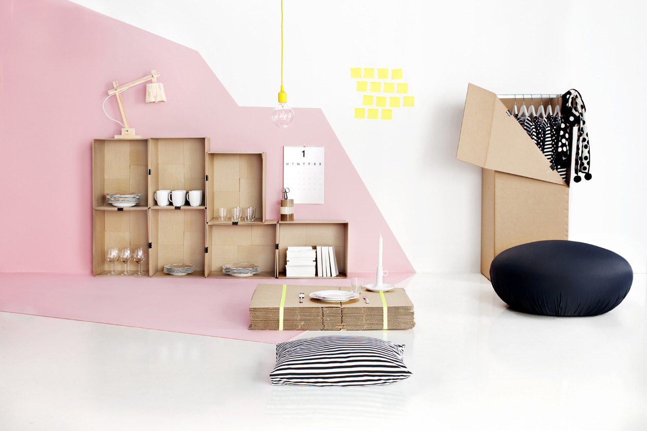
As we head towards Winter I thought I would focus on the beautiful sunshine of the last couple of days rather than the chill in the air and share with you some neon brights. Trending big-time for Spring | Summer 2012, who says we can't embrace this right now? I particularly love neon mixed with soft pastels. 


Sources:

http://www.perscentrumwonen.nl/
http://www.homelife.com.au/

VIEW STORY
Pin ThisShare on Tumblr
 

T.D.C© Theme by Blog Milk